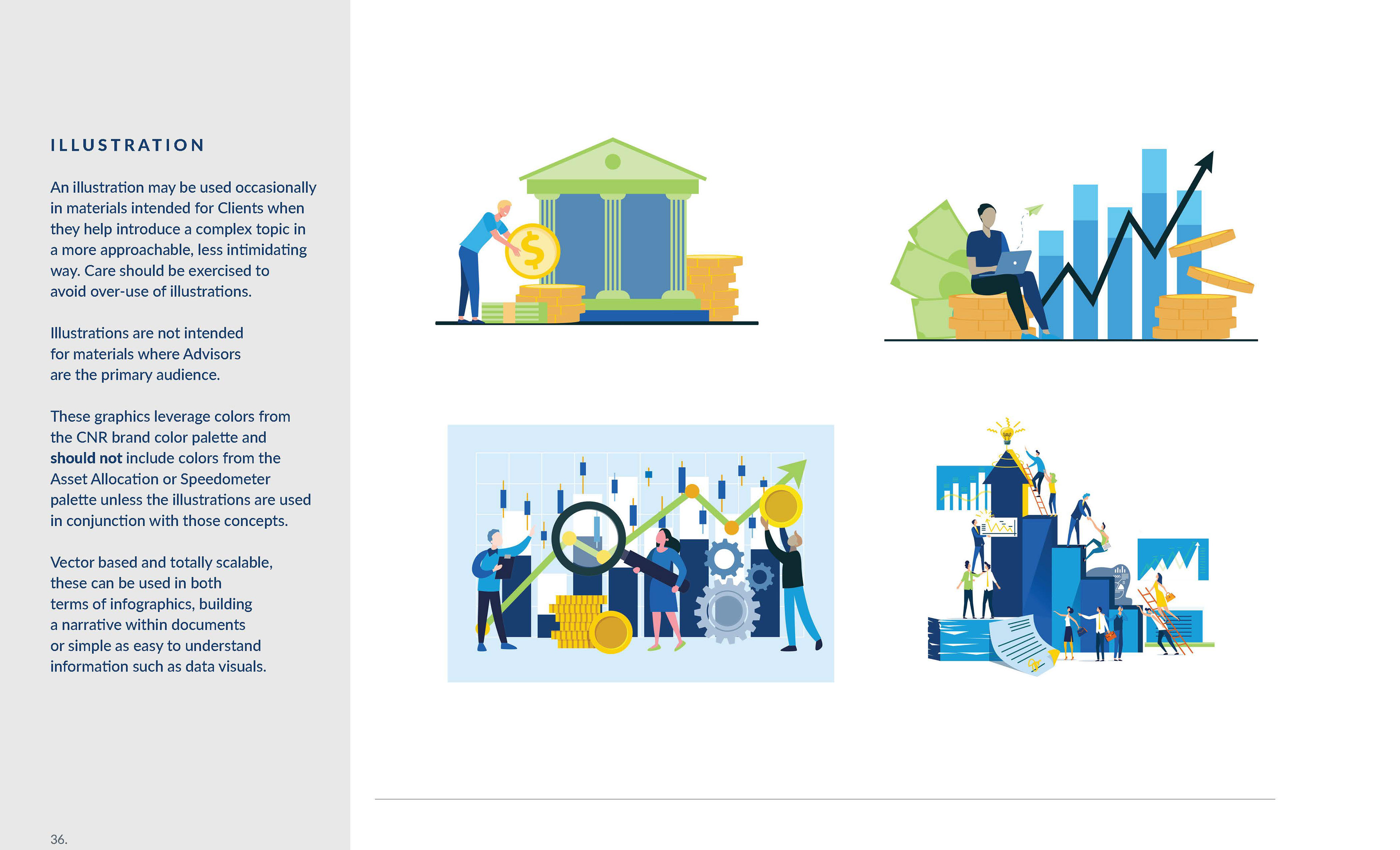
The design process is a fluid and subjective cycle.
The spot a project starts in is almost never where it ends up and the journey is sometimes as important as the destination.
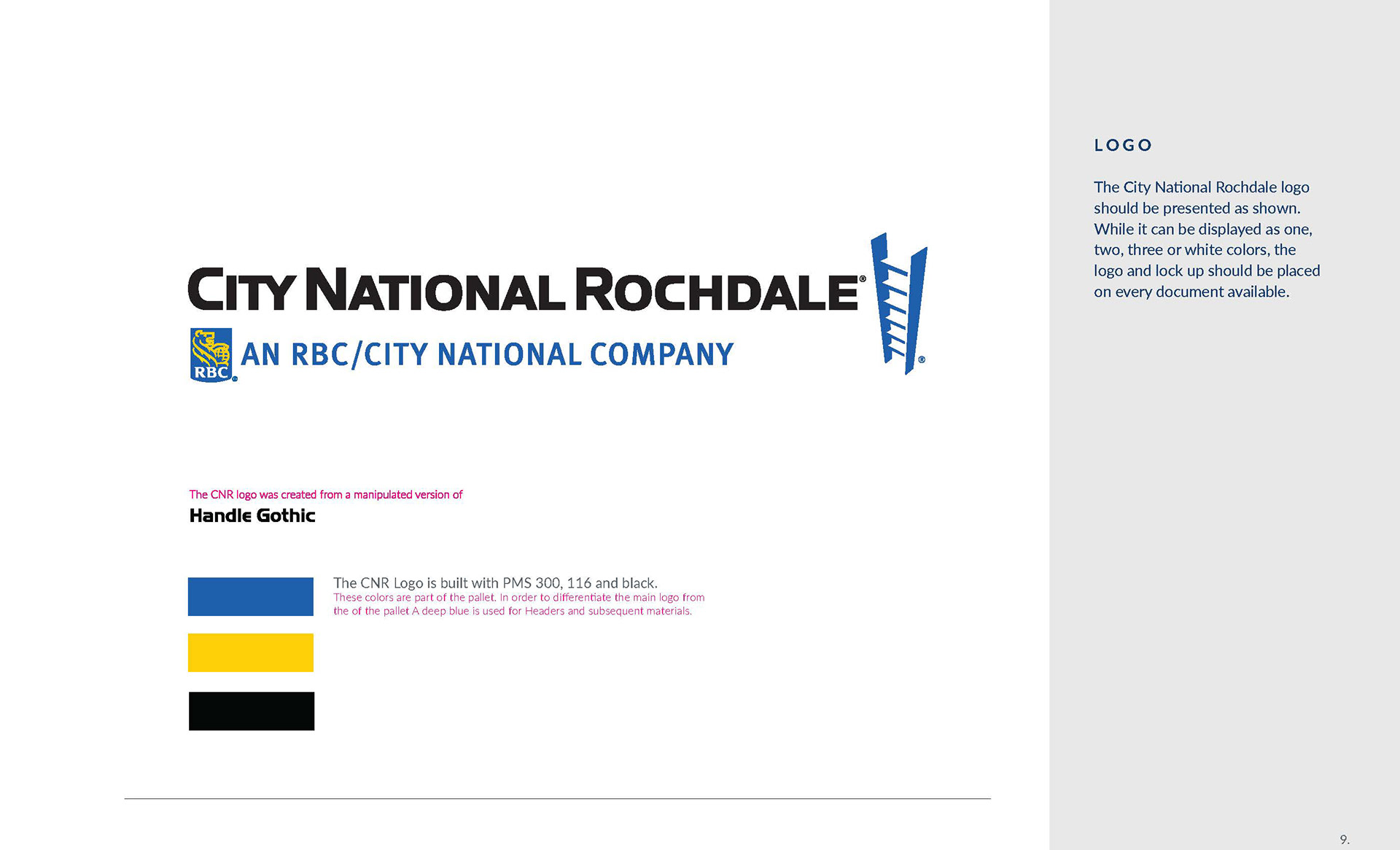
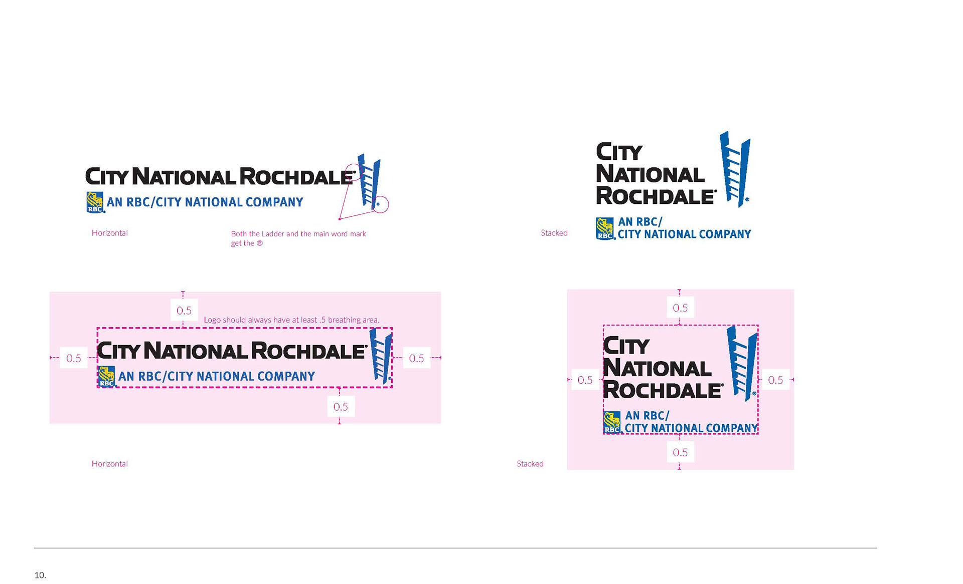
The Process begins with a design brief; a series of questions related to the company as a whole, and discovering the reason the product/brand exists. For CNR, this extended to internal templates, PowerPoint decks, white papers and more.
This also includes:
• Phrasing & Messaging
• Brand story telling
• Internal vs external communications
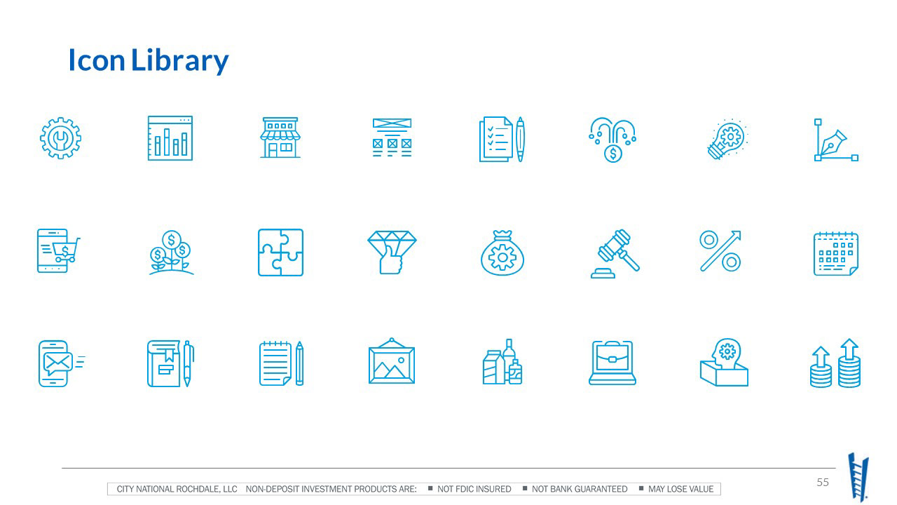
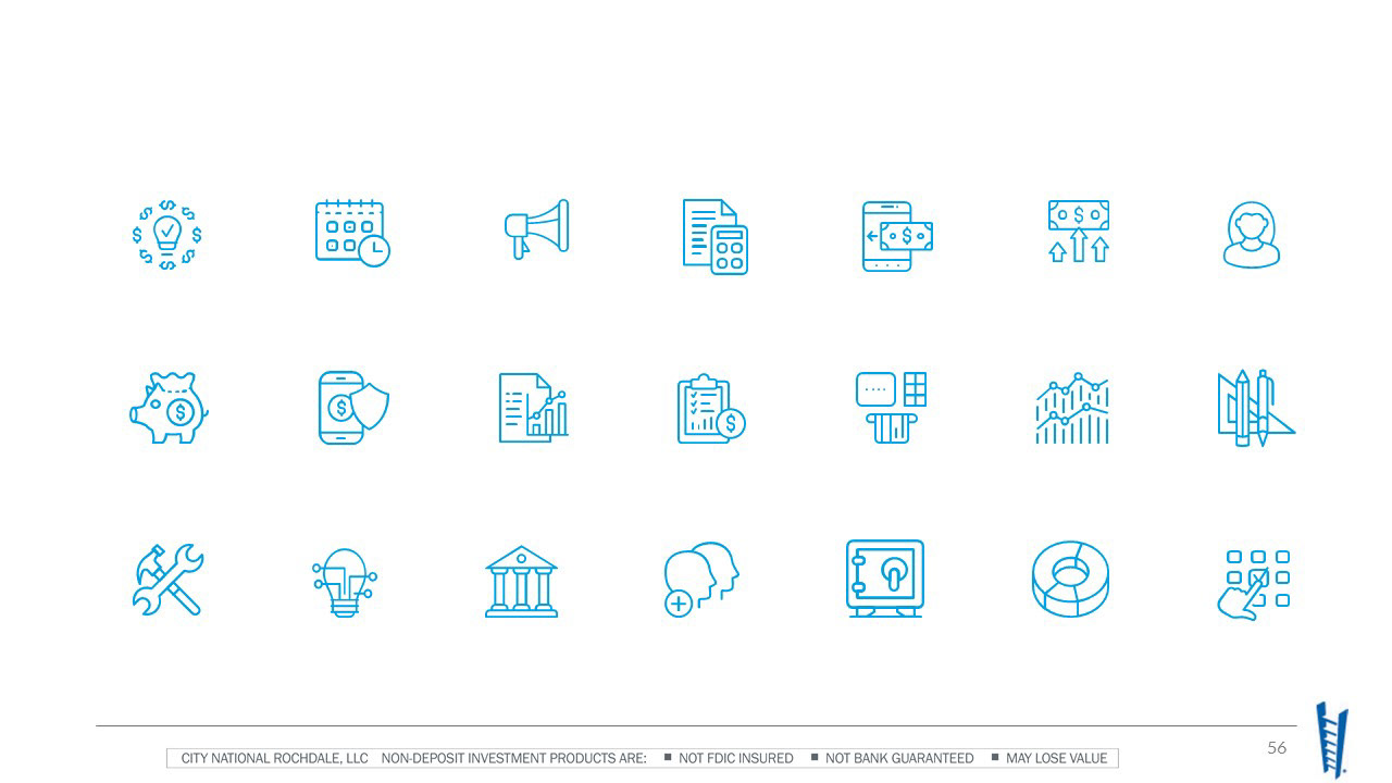
• Template customization -education for skill sets and involvement
• Expansion of brand as a whole
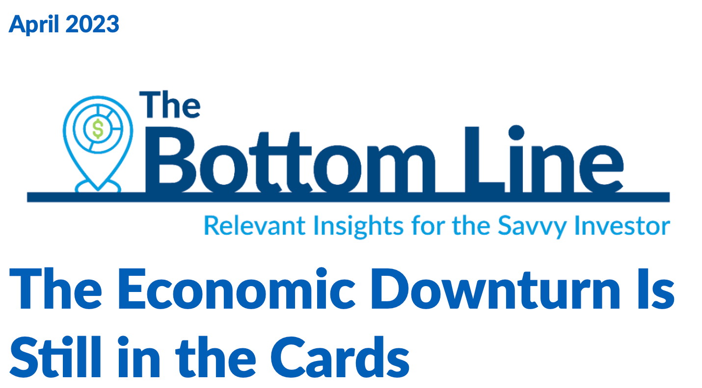
A CASE STUDY
CITY NATIONAL OF ROCHDALE
PROBLEM: NO DIRECTION
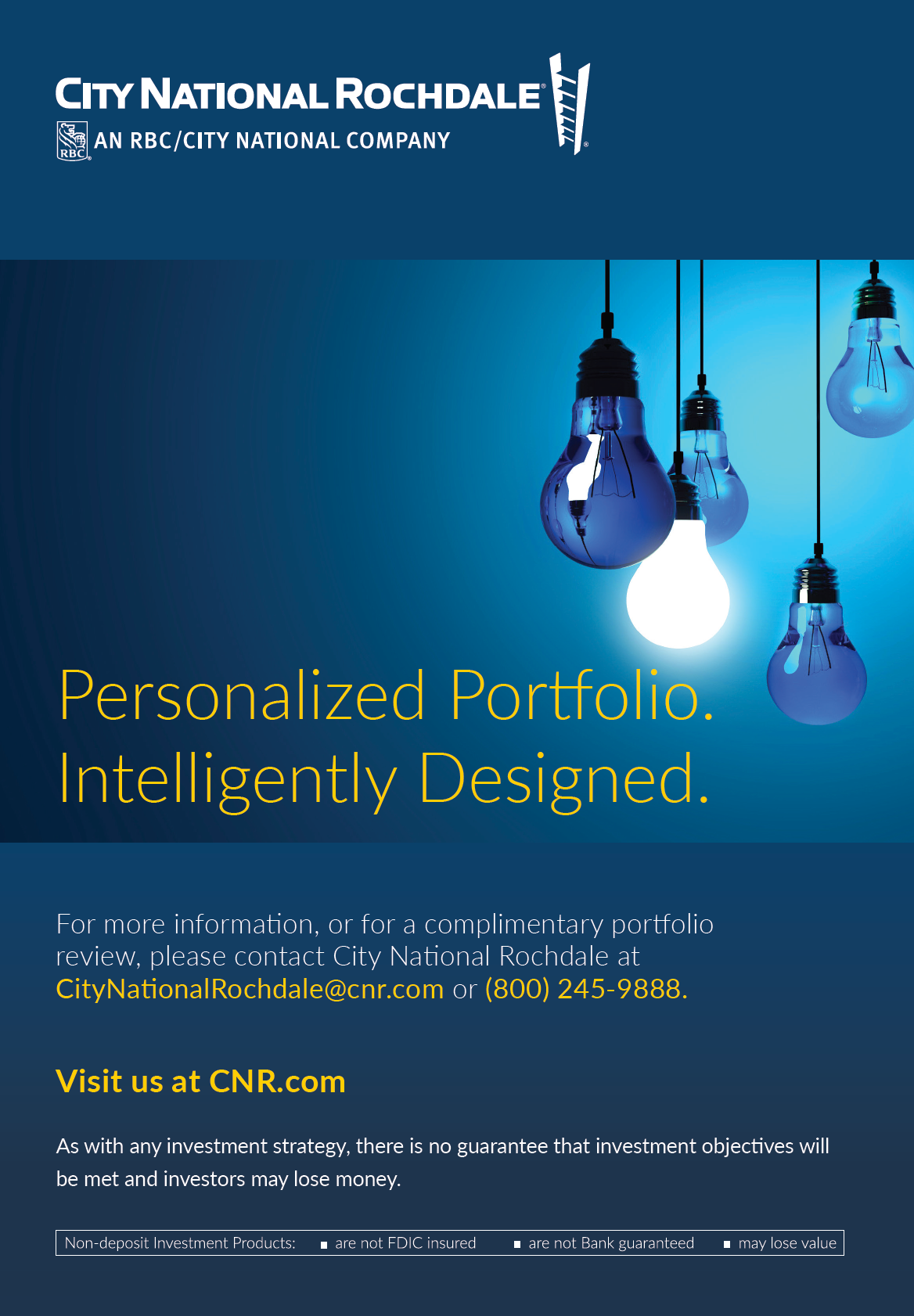
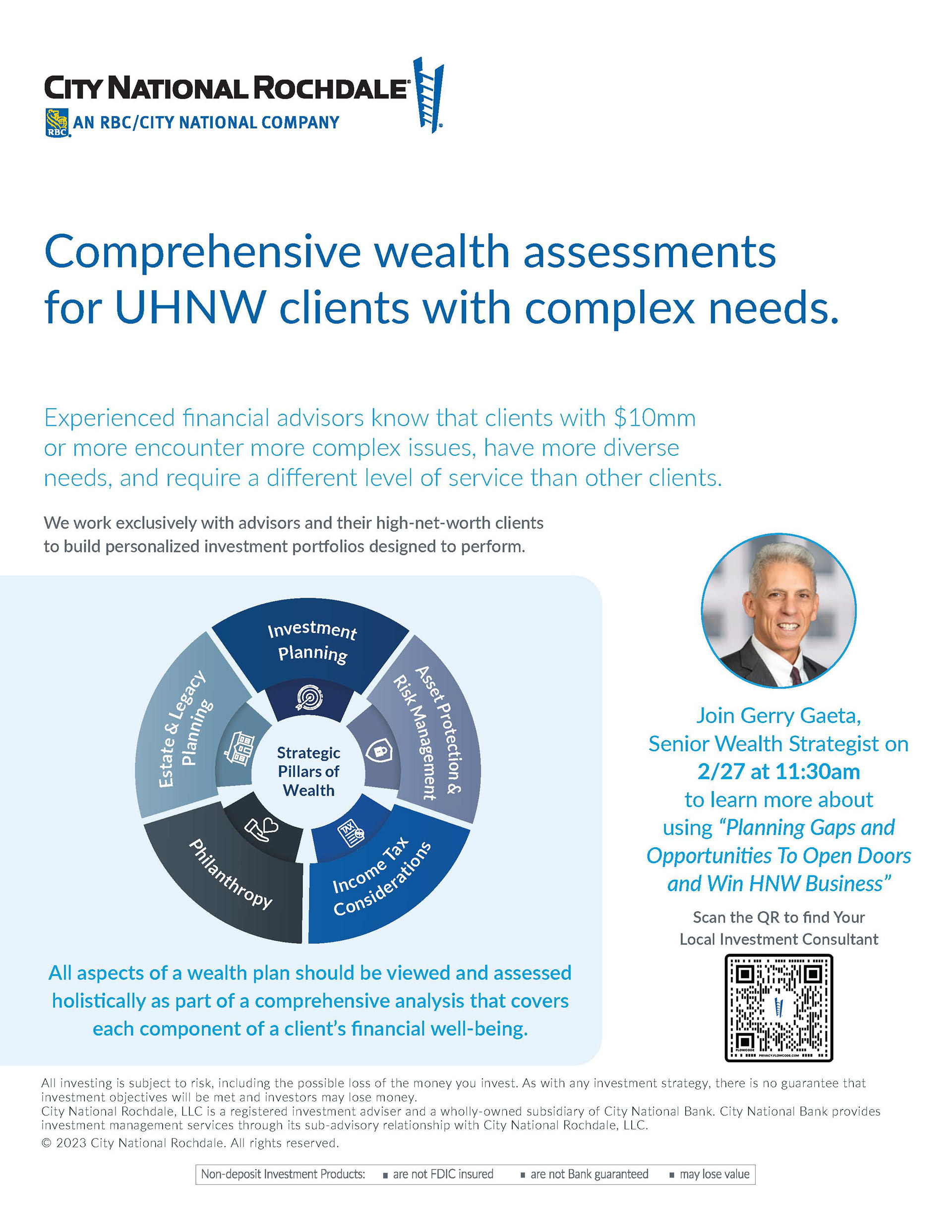
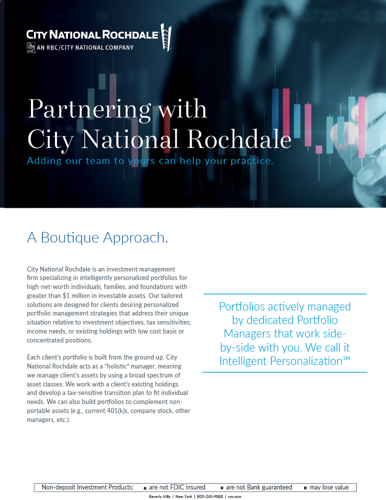
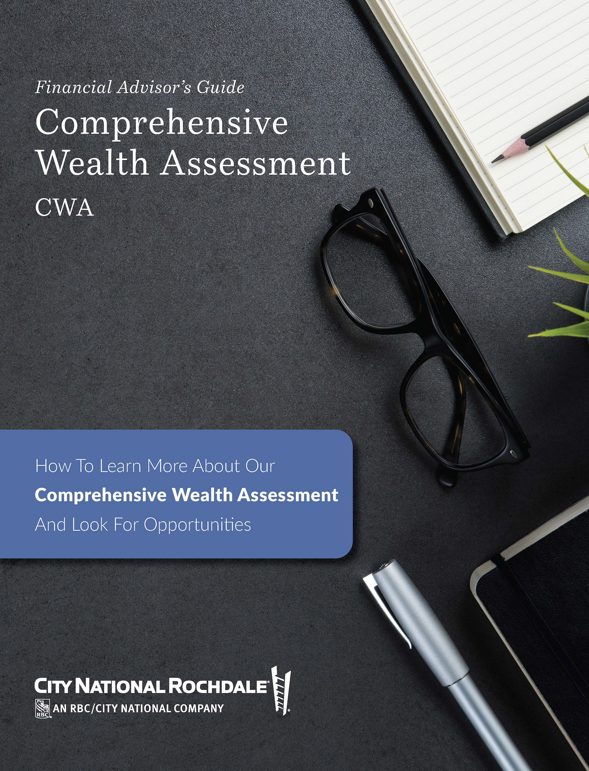
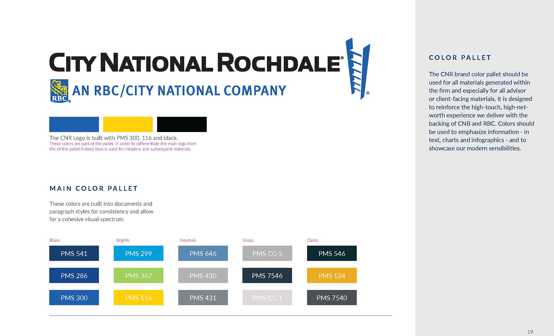
A bank wholly owned by another company presents its own set of challenges. City National of Rochdale needed its own voice to set itself apart from City National Bank and remind people they were a part of that brand structure. This meant polishing what was old into something fresh and exciting. We started with a color palette update and the project rippled out from there organically.
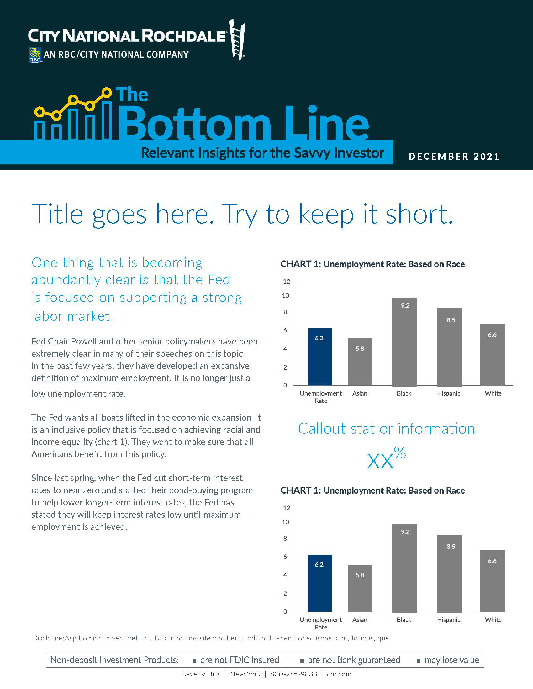
Stodgy and dated in its original format, the problem became brightening the brand up and giving it livelihood and the energy it was lacking.
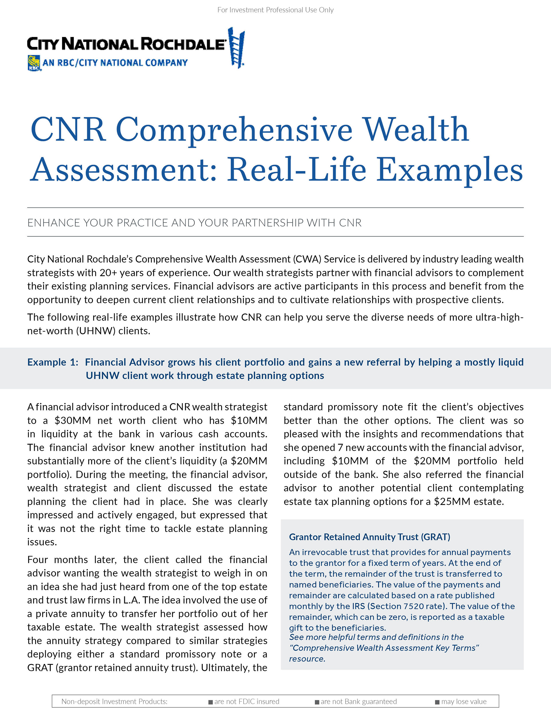

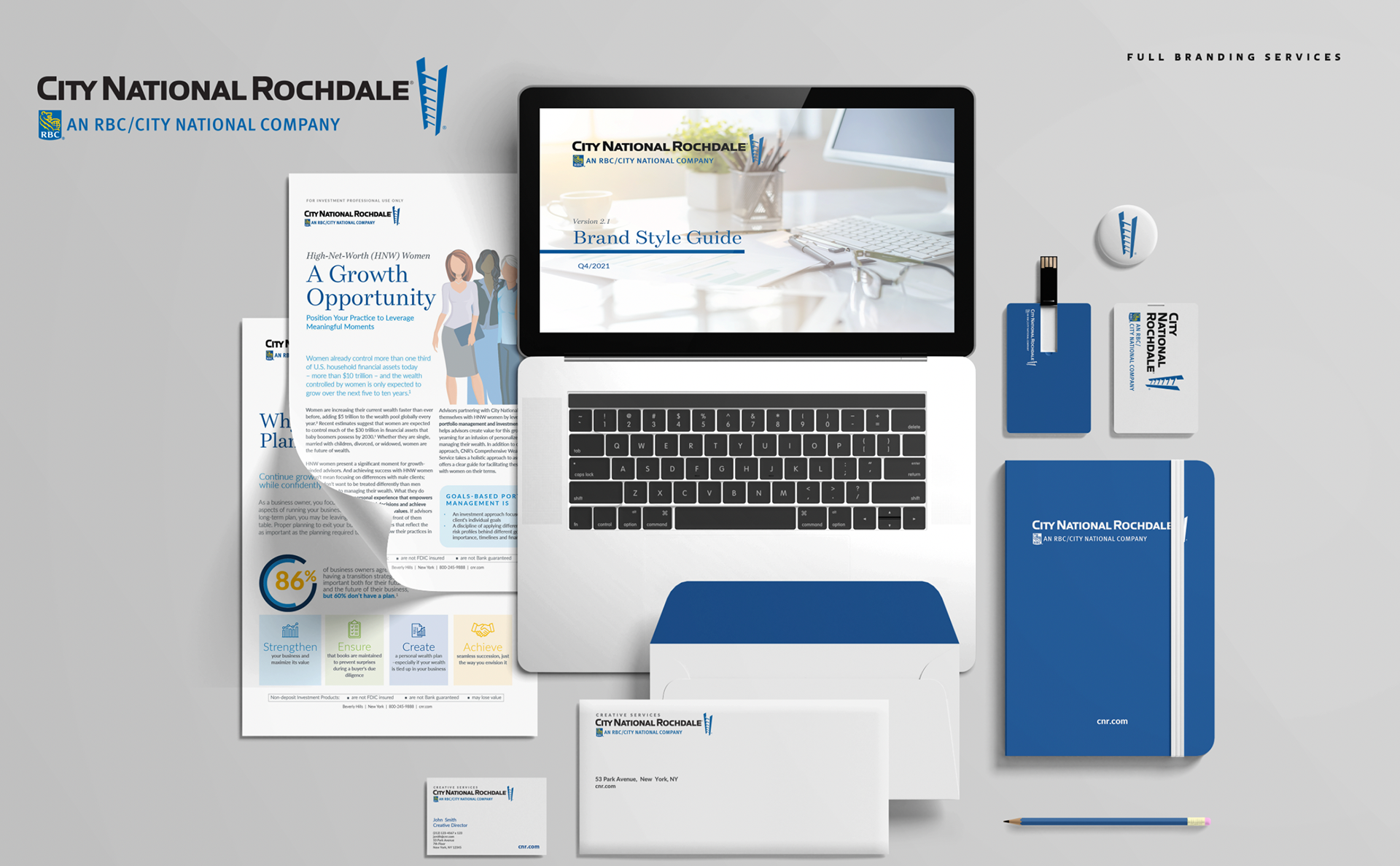
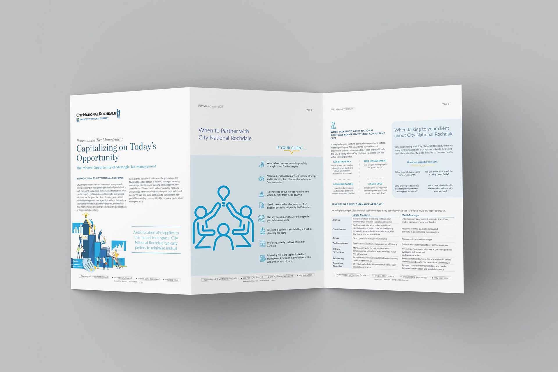
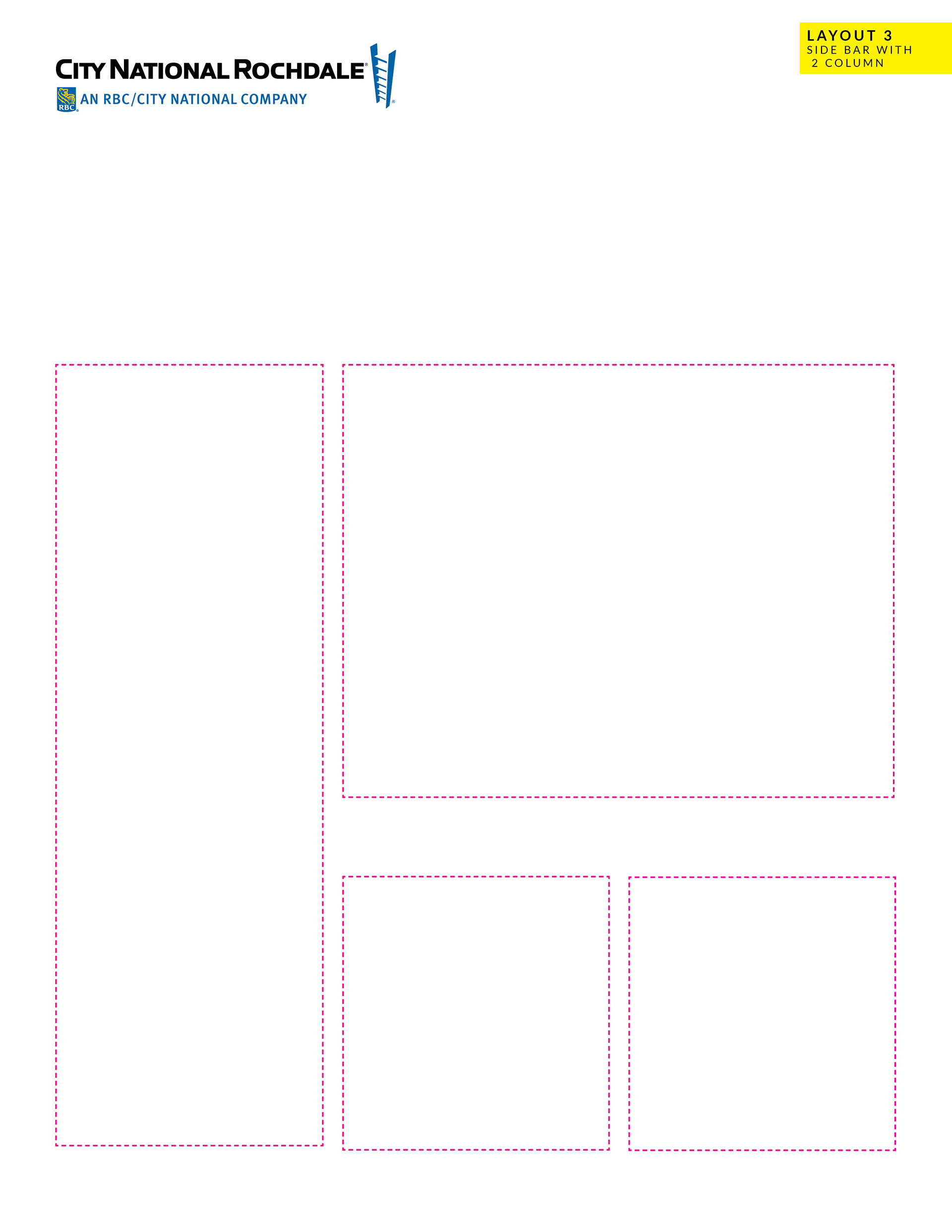
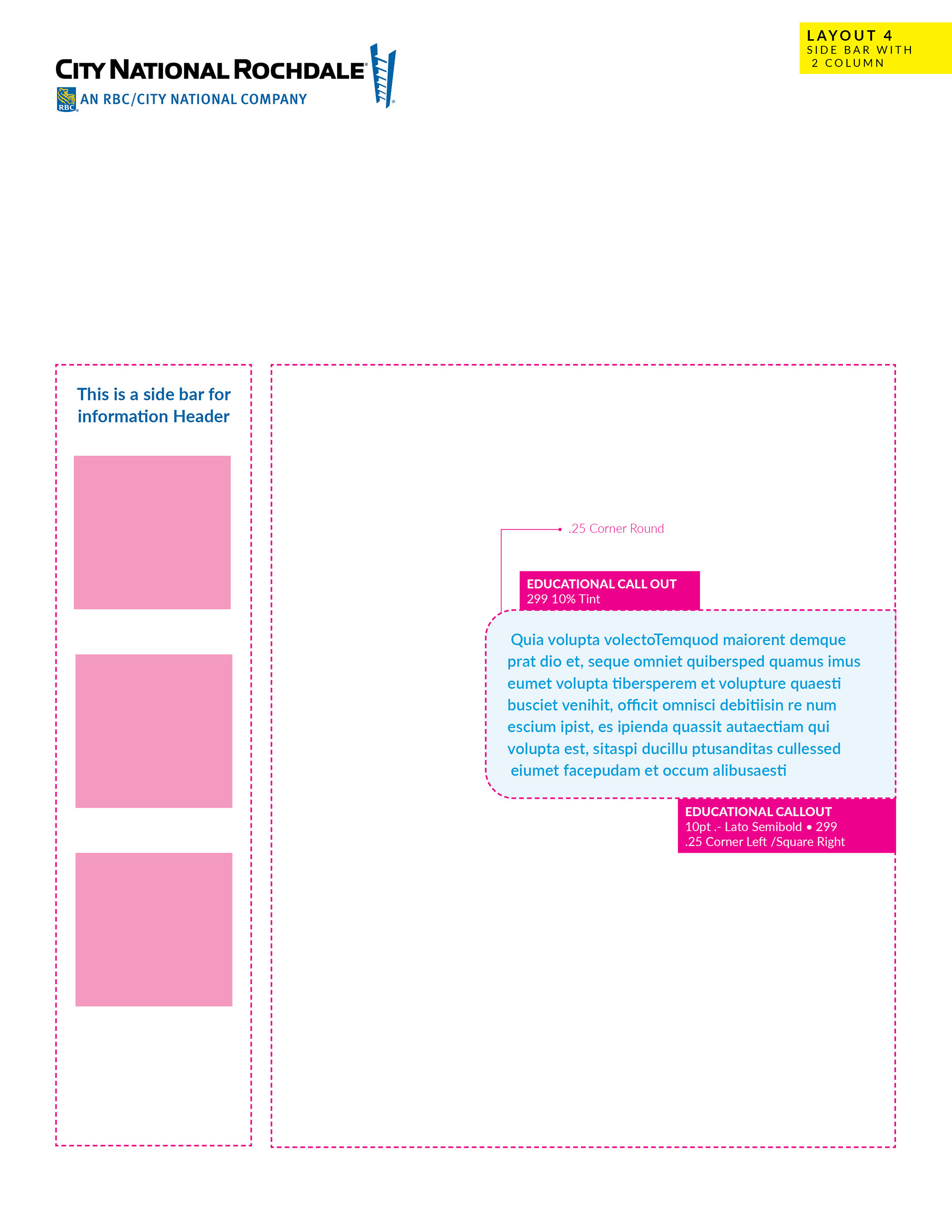
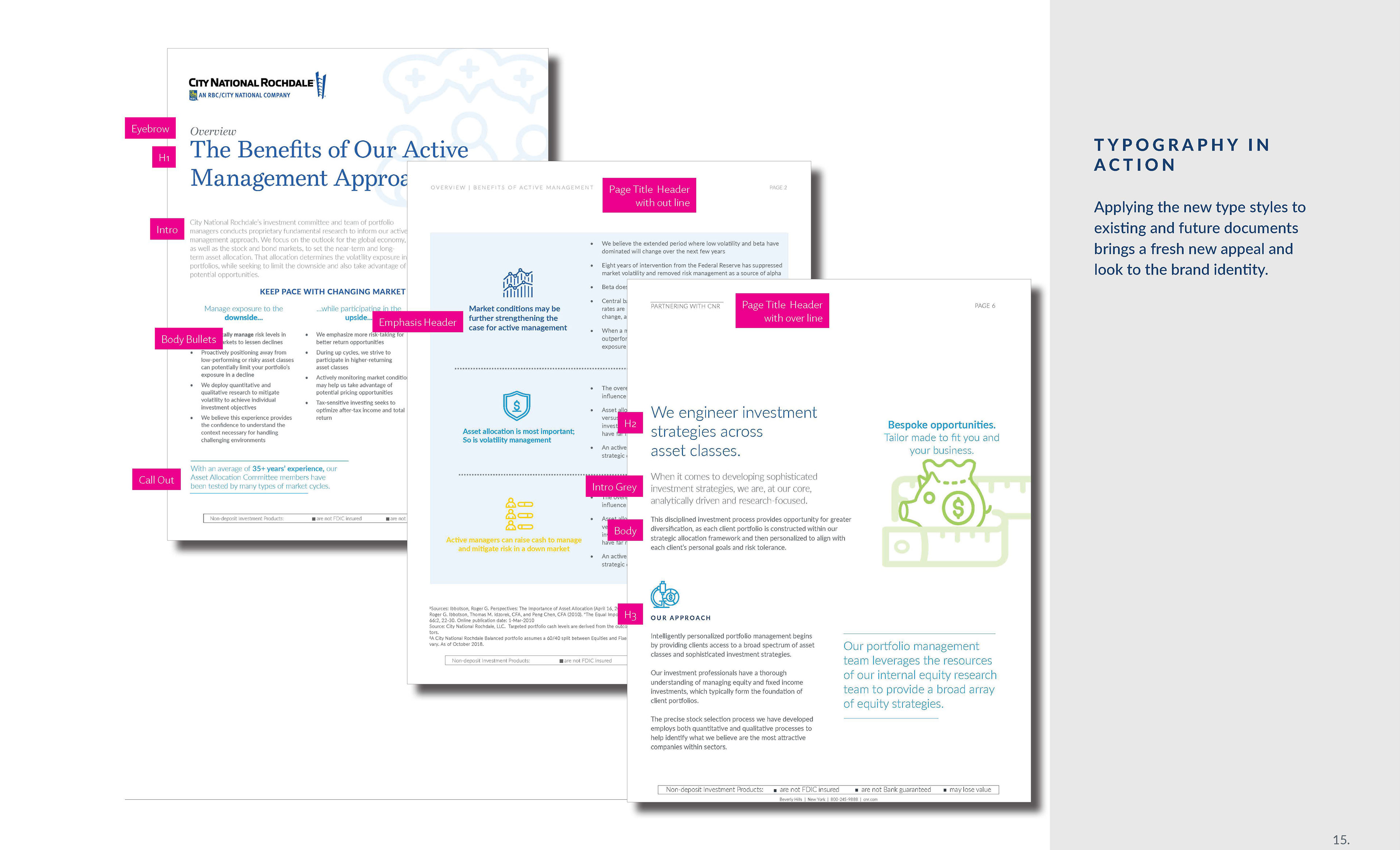
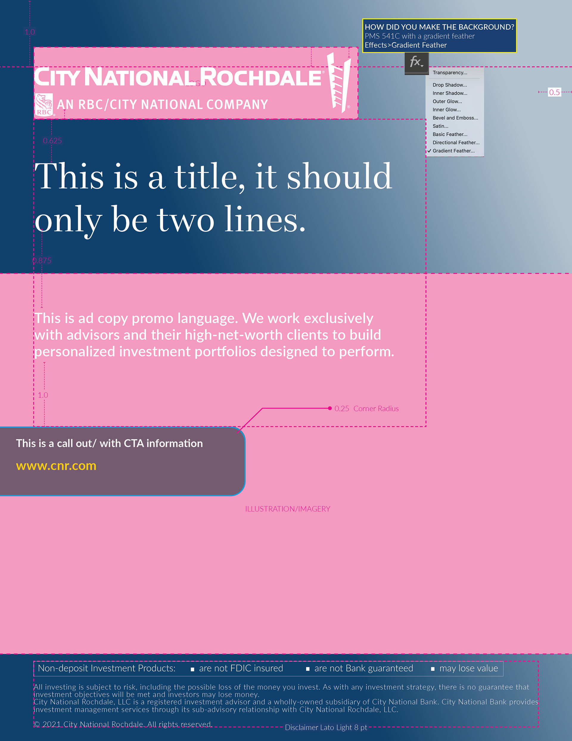
As the project expanded, so too did the need for consistency so the brand identity was key to locking everything in place across all channels. Structure became important, to illustrate how the document was created and why, and all the notations harken back to te brand guidelines so users have a clear line from how the document got built.
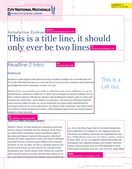
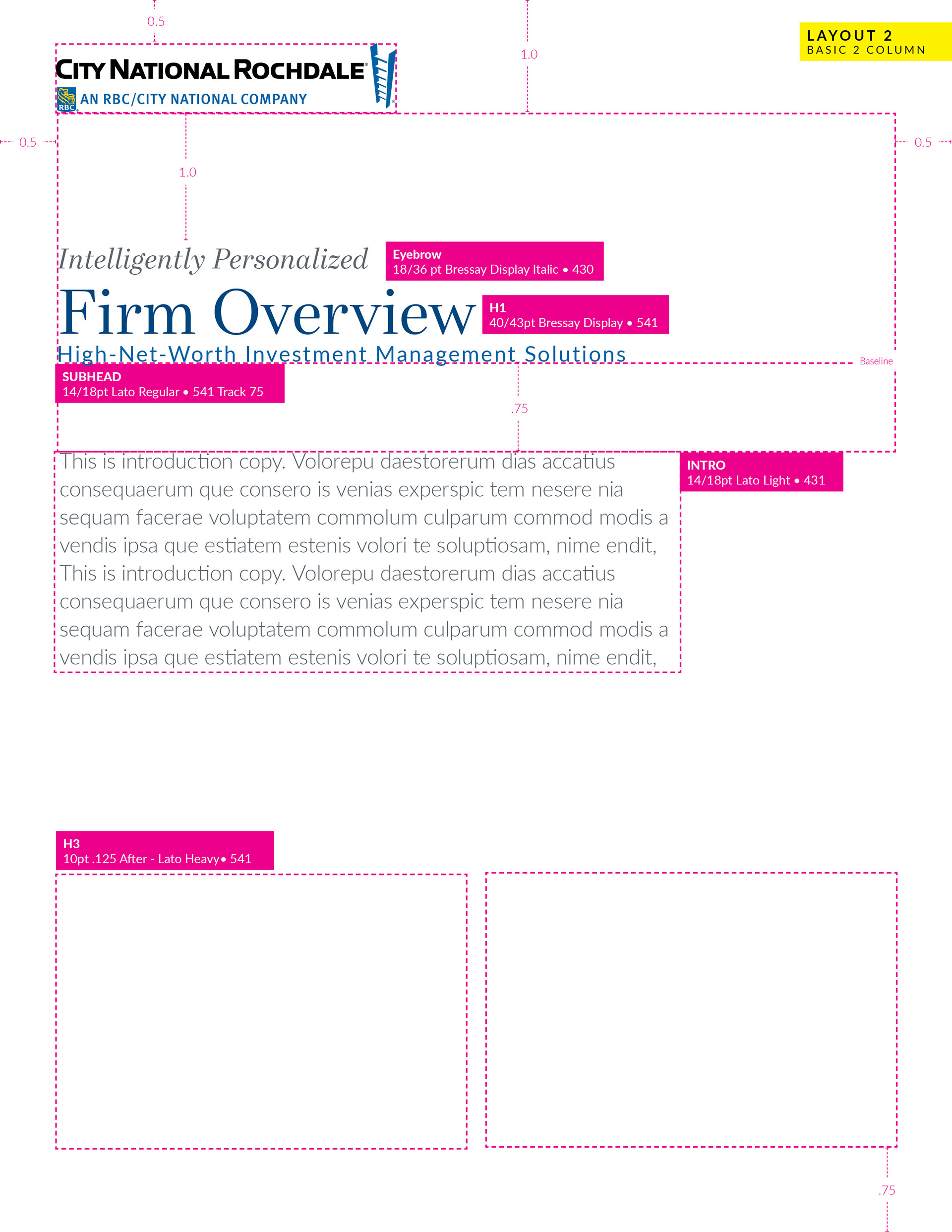


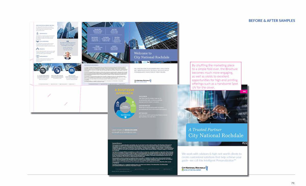
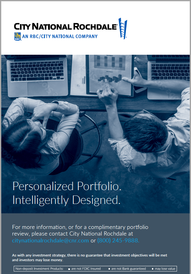
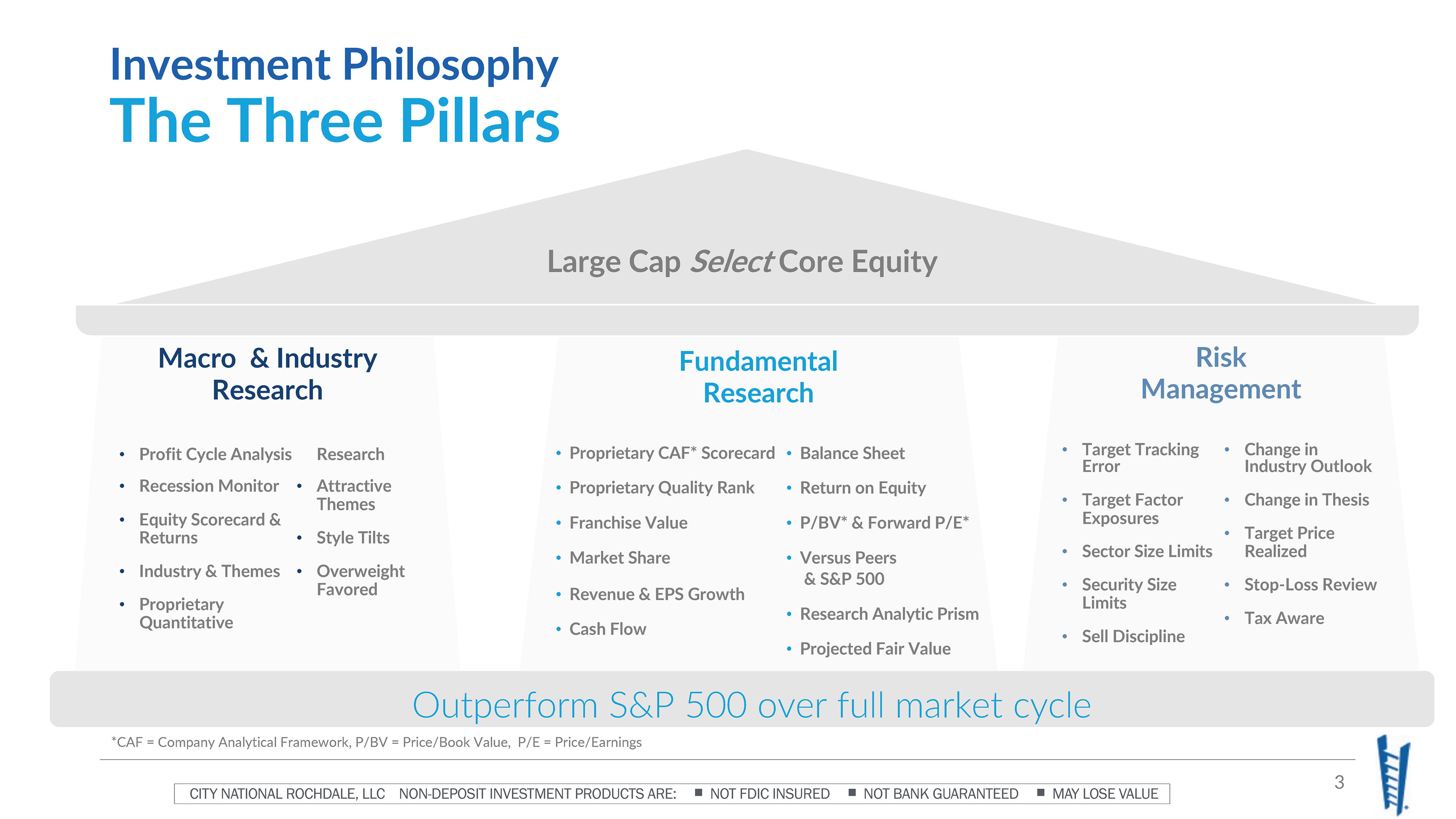
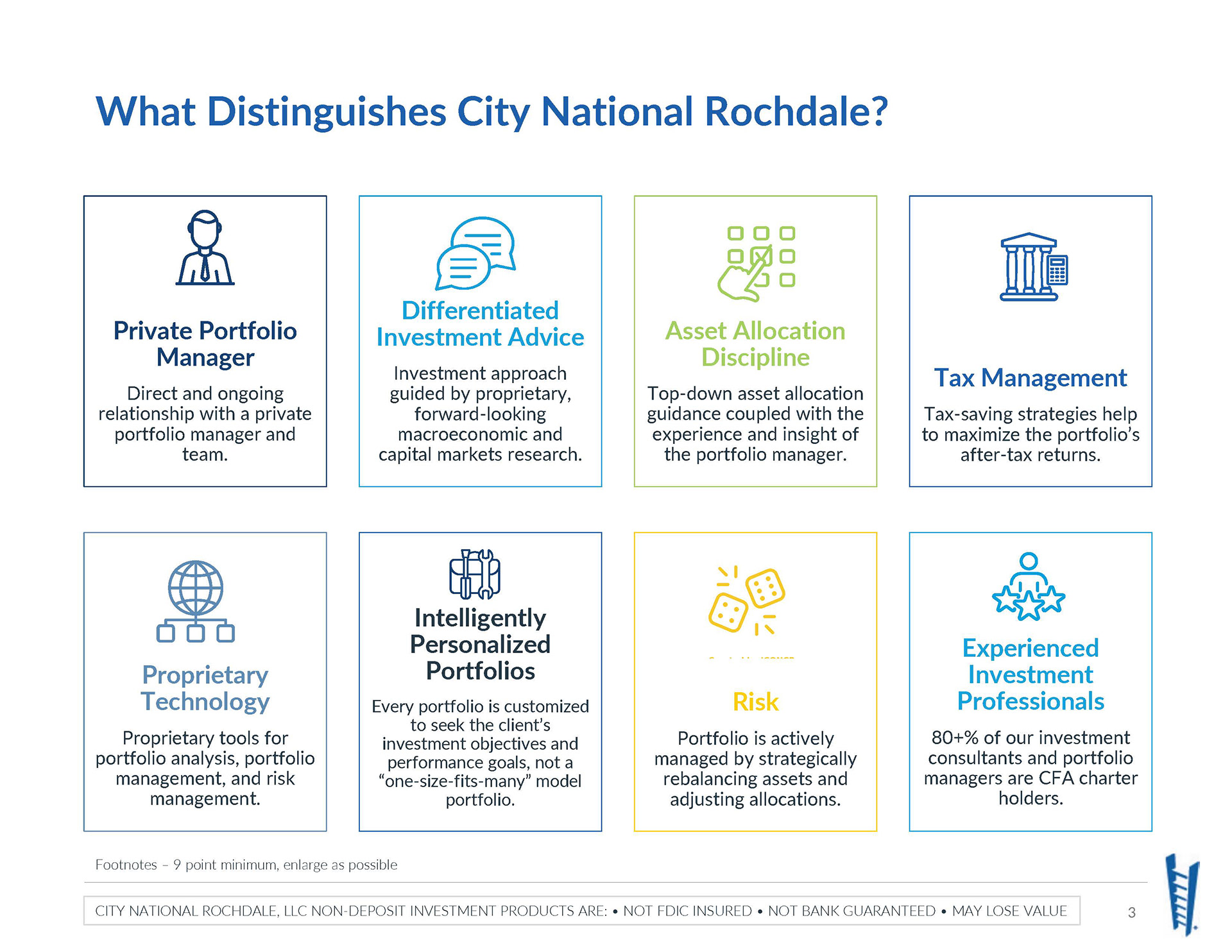
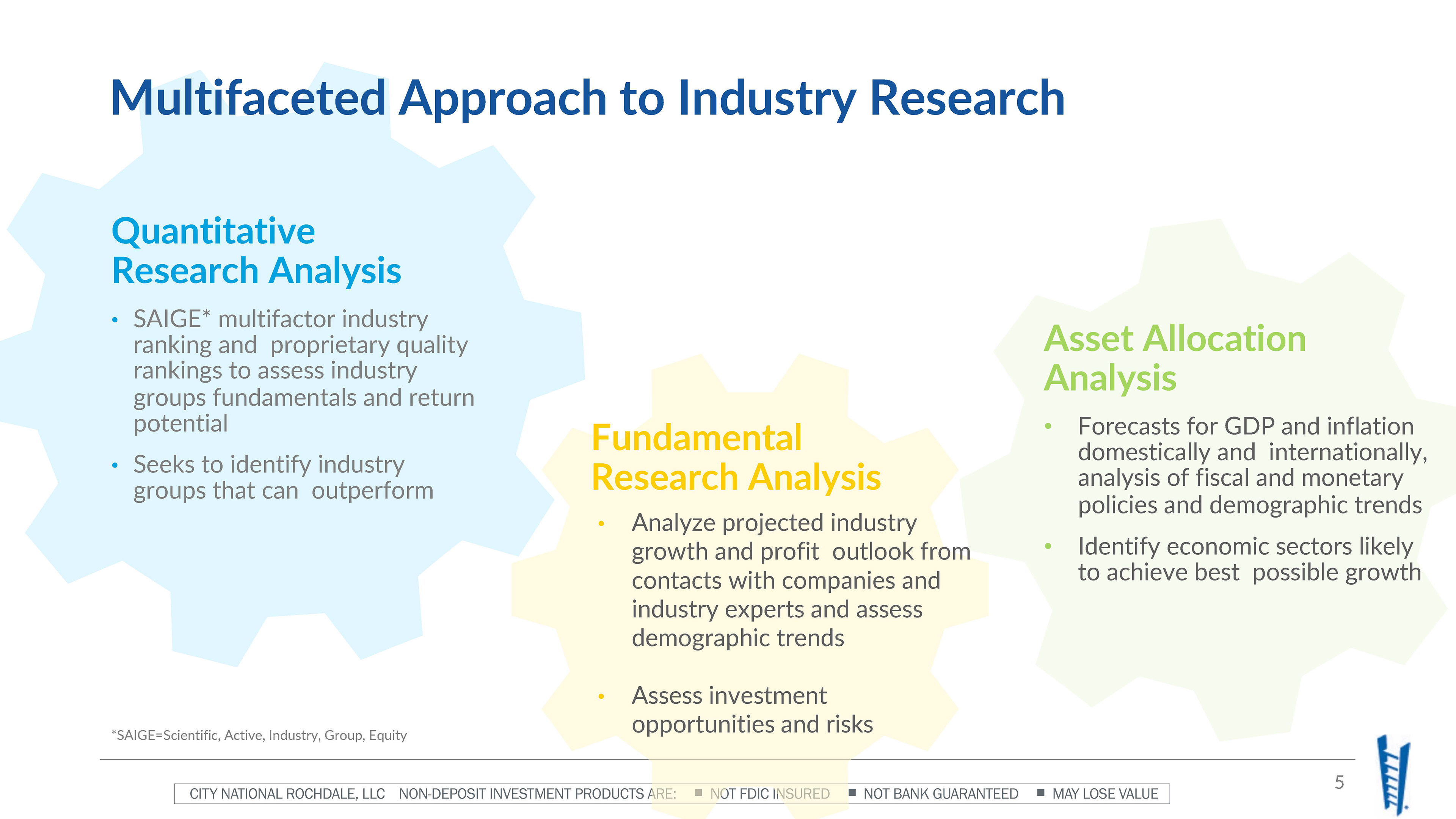
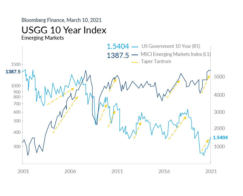
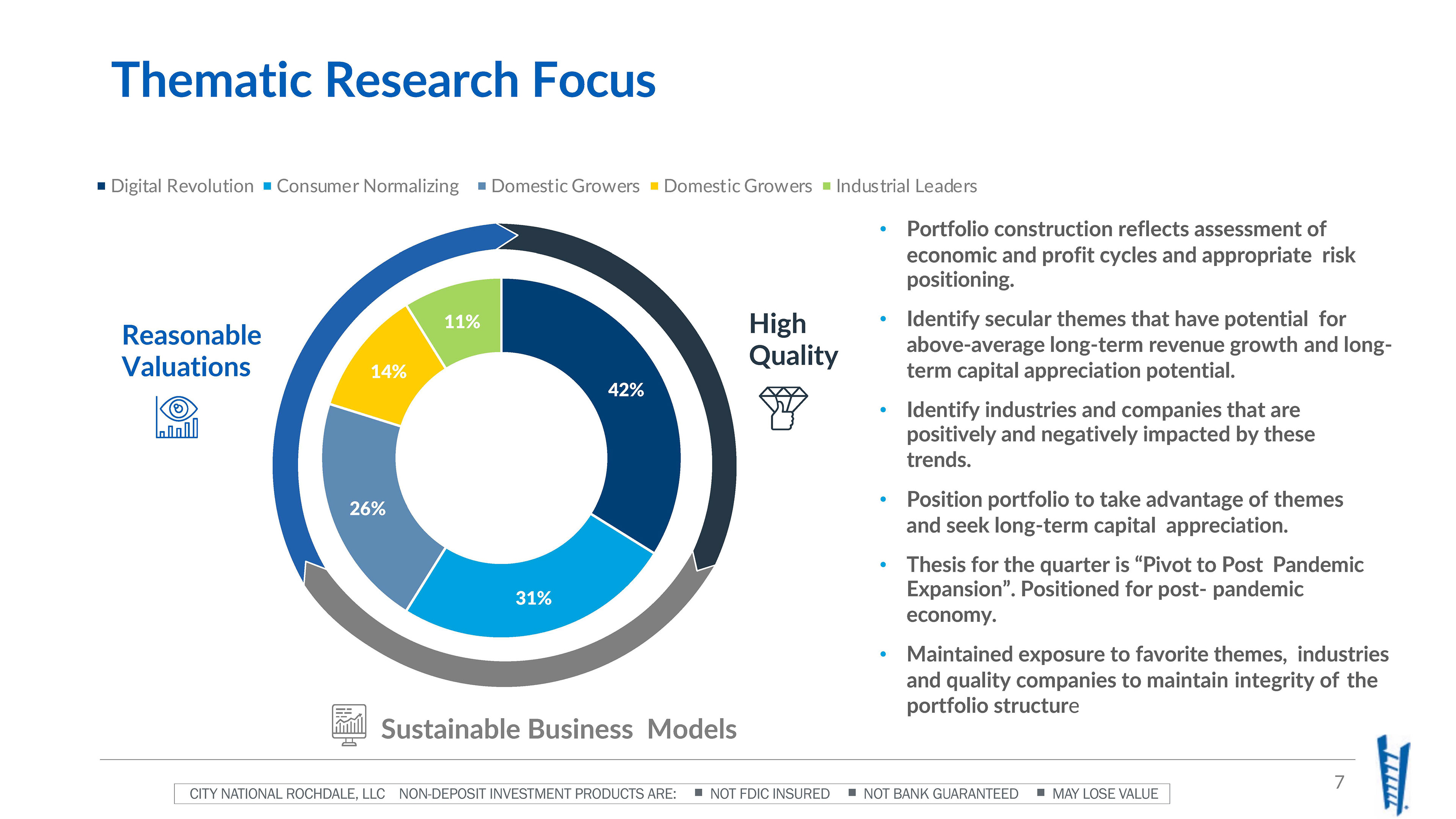
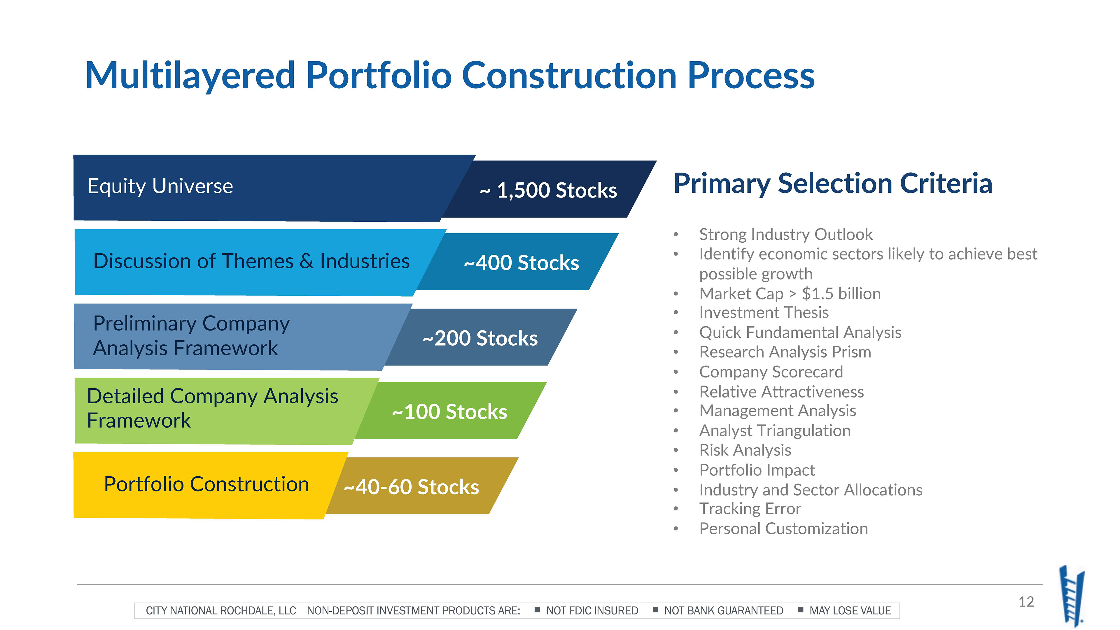
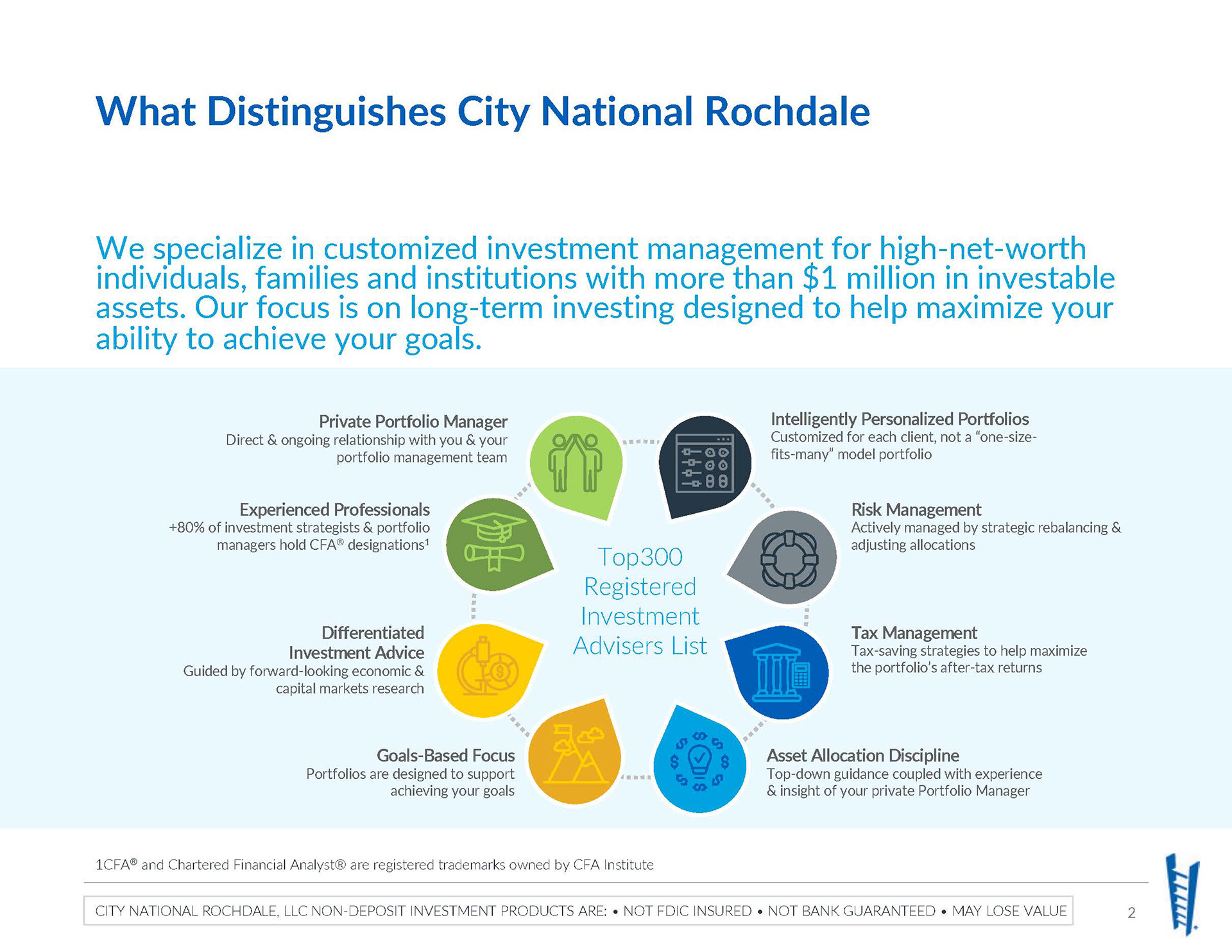
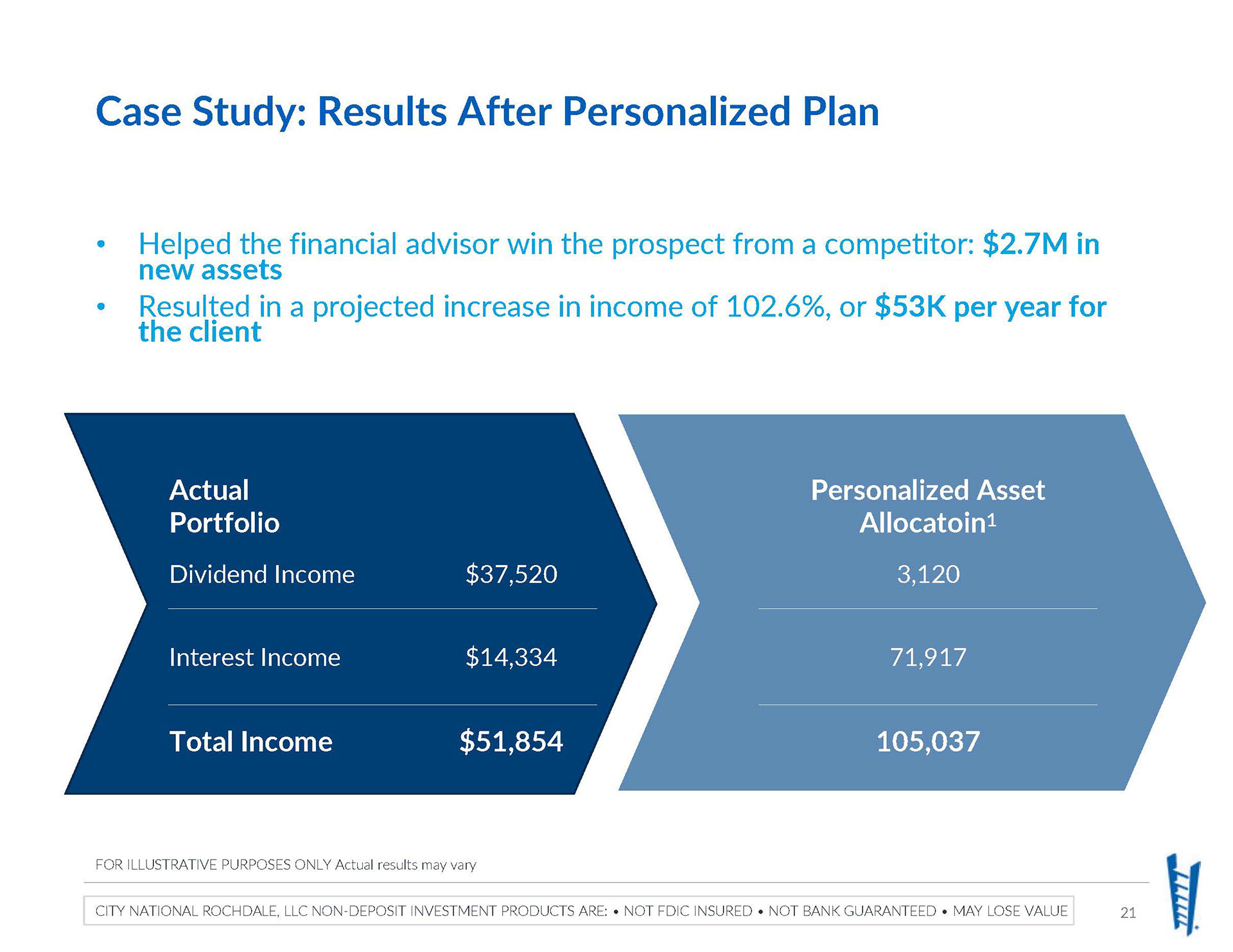
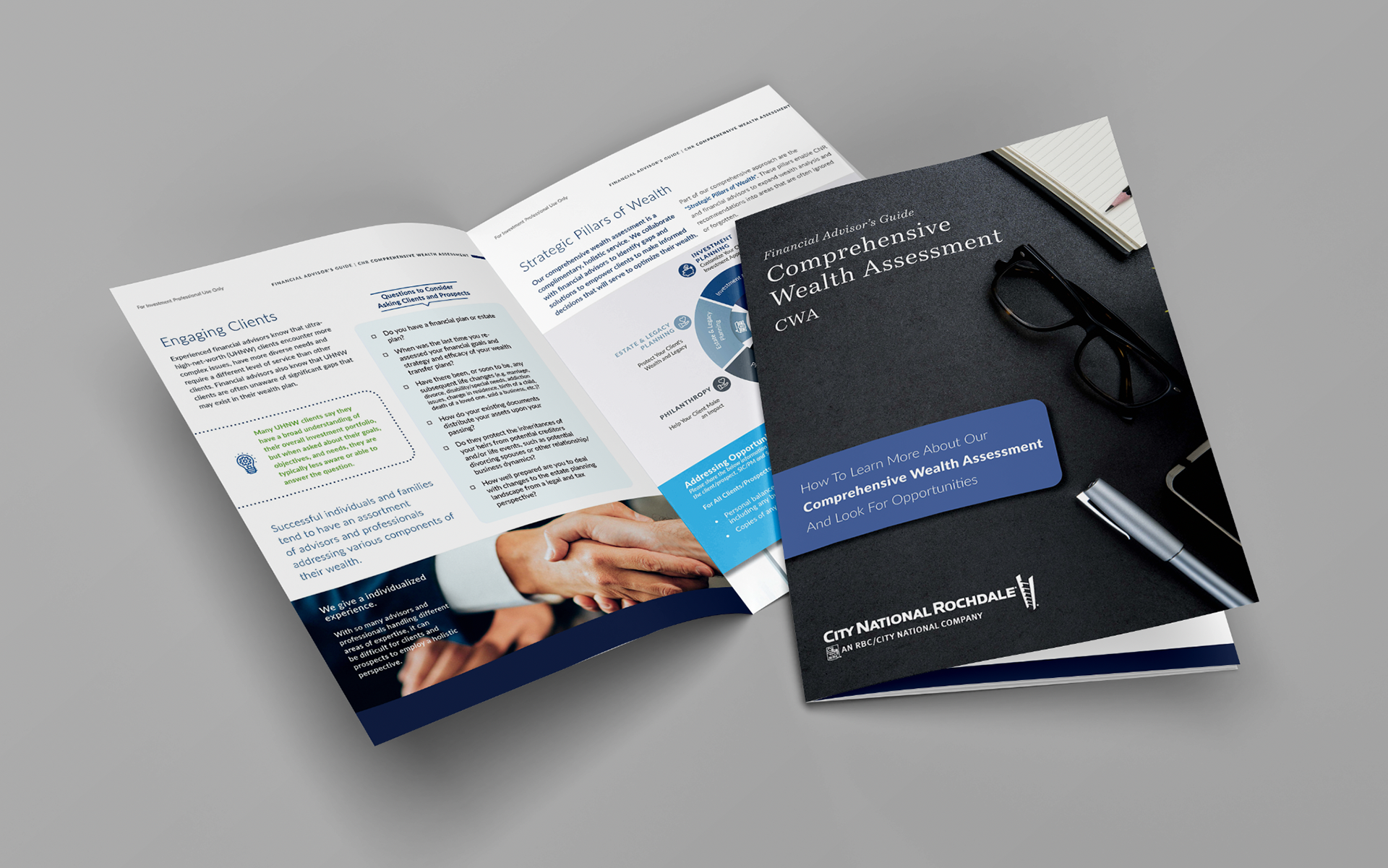
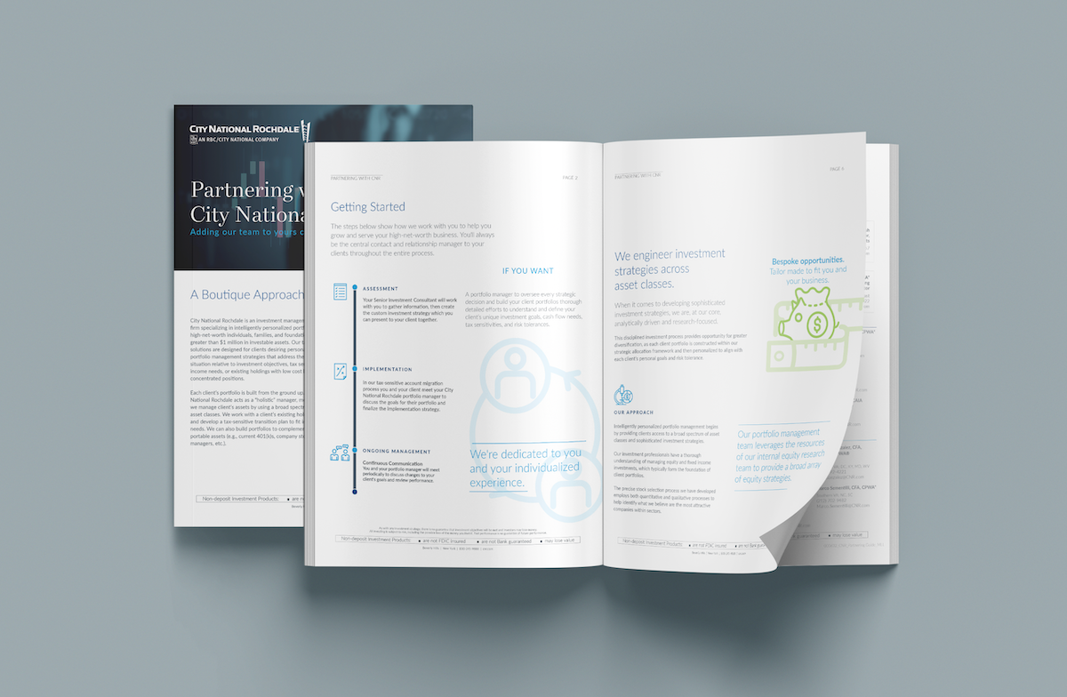
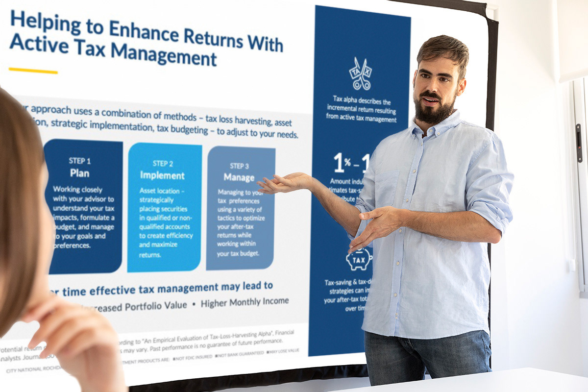
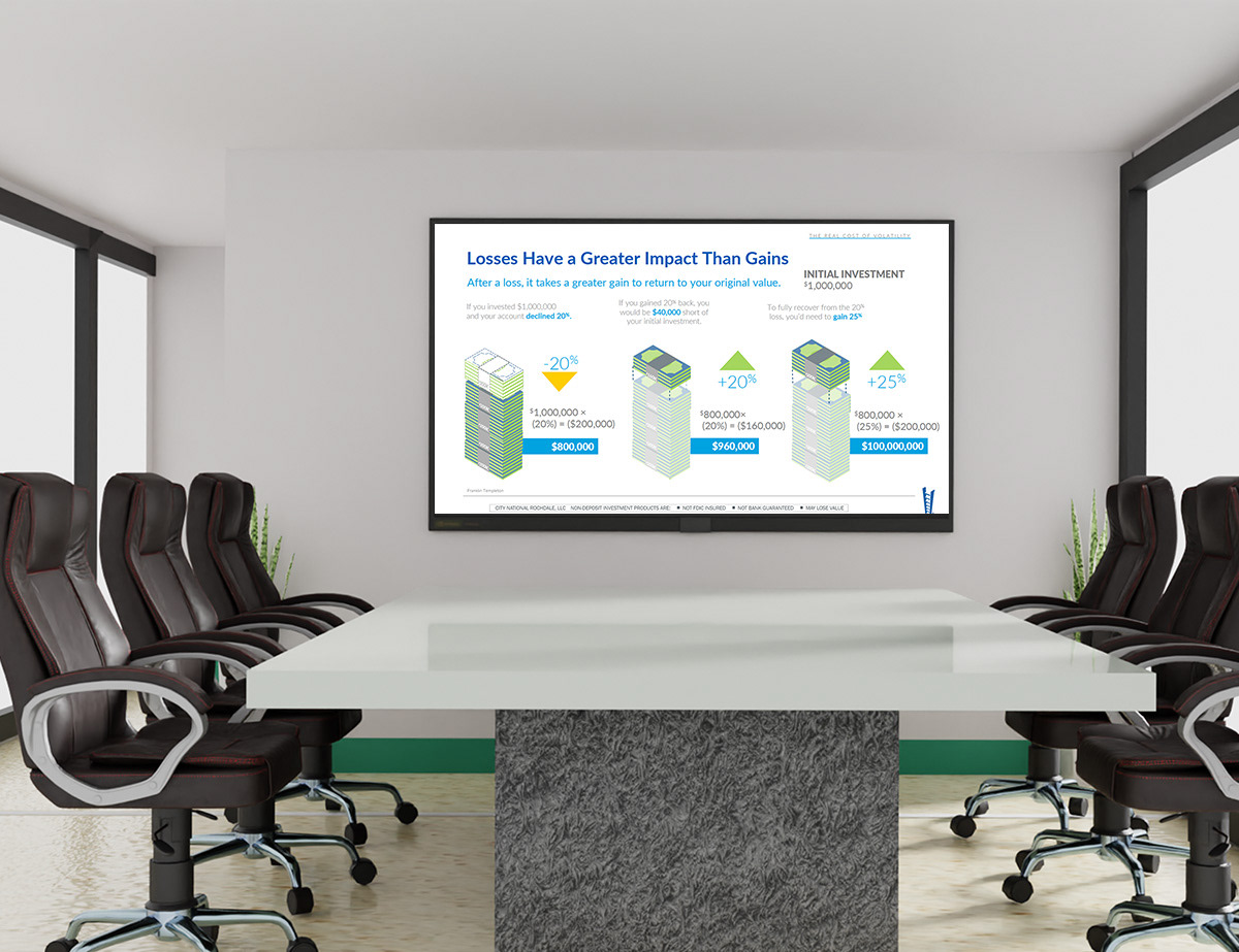
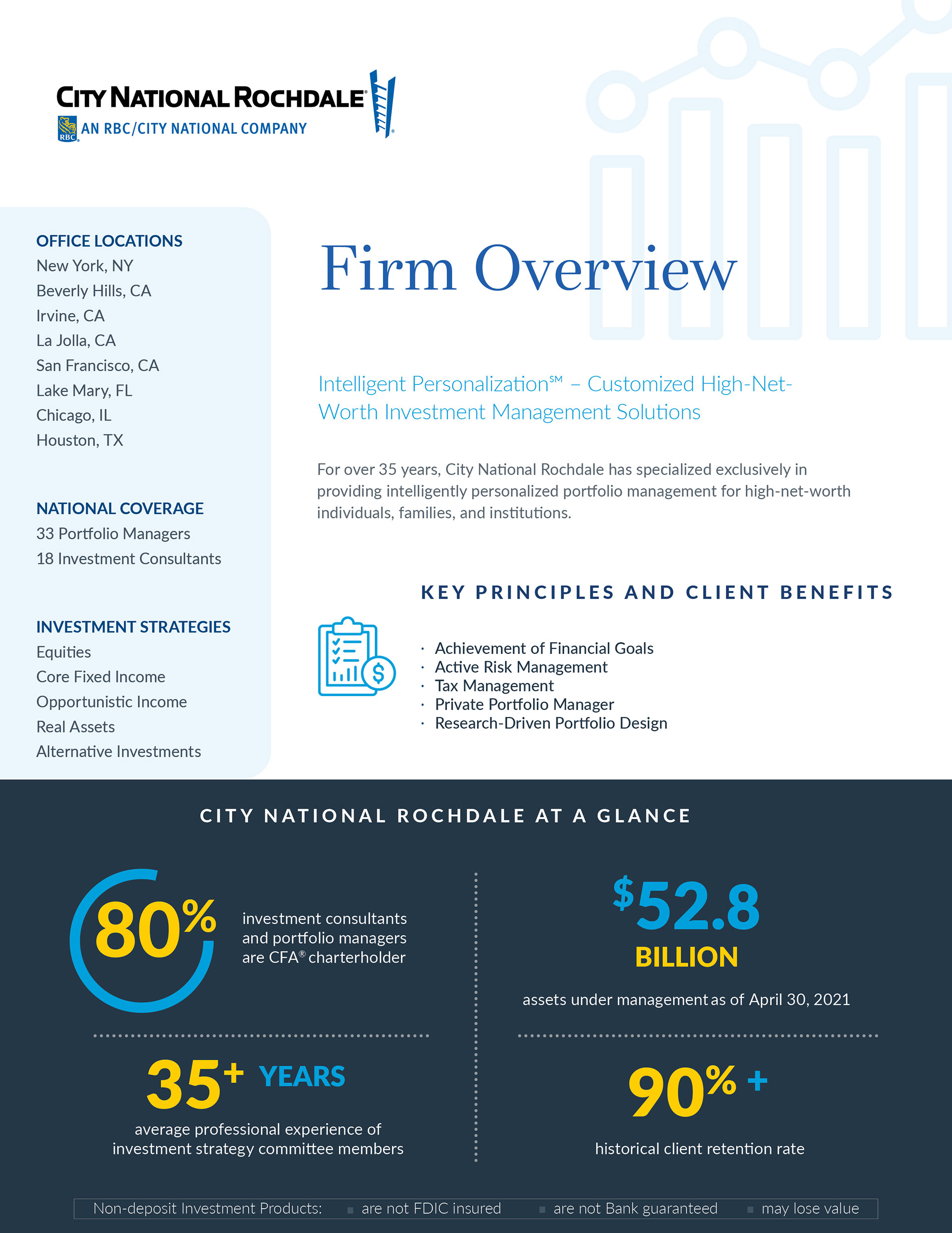
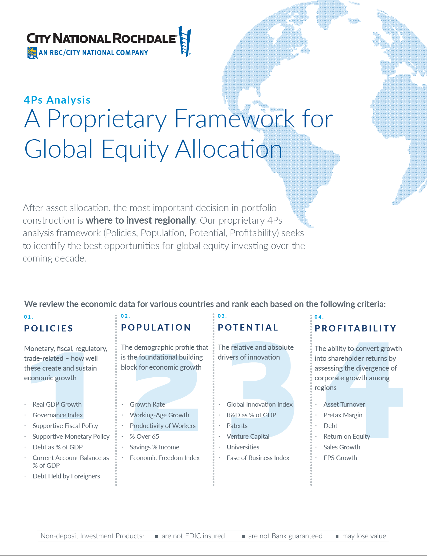
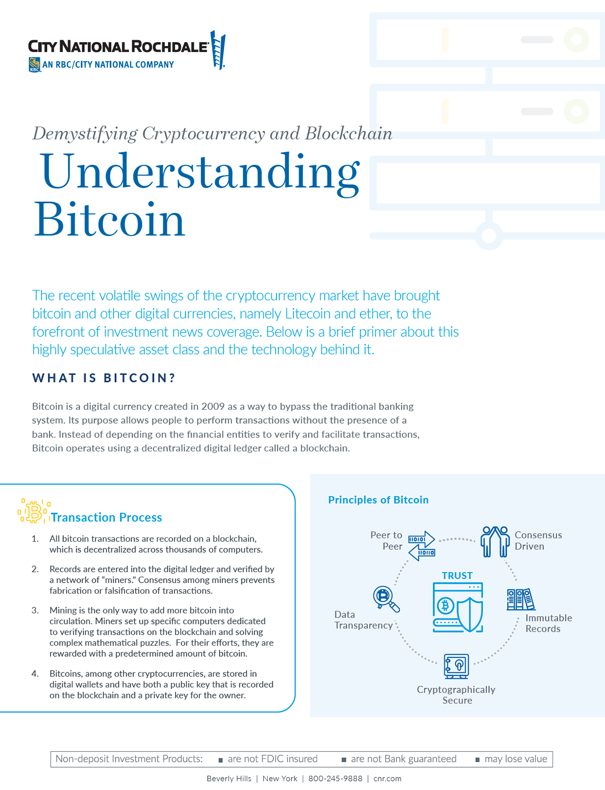
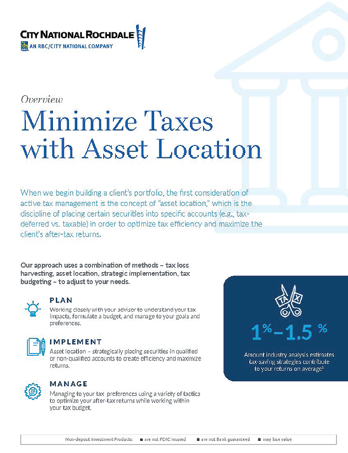
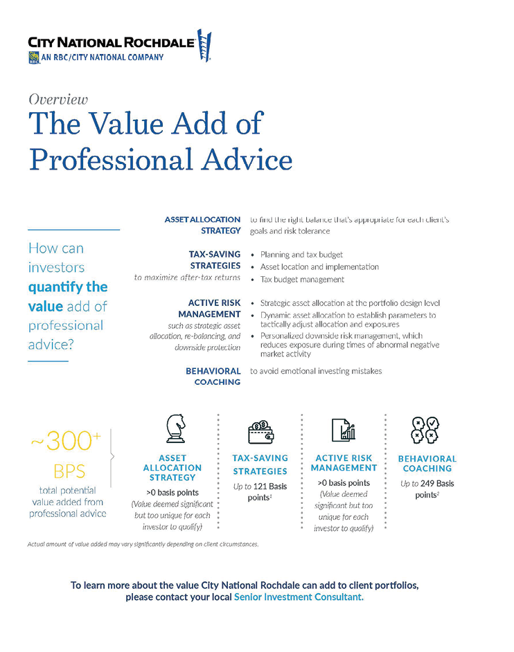
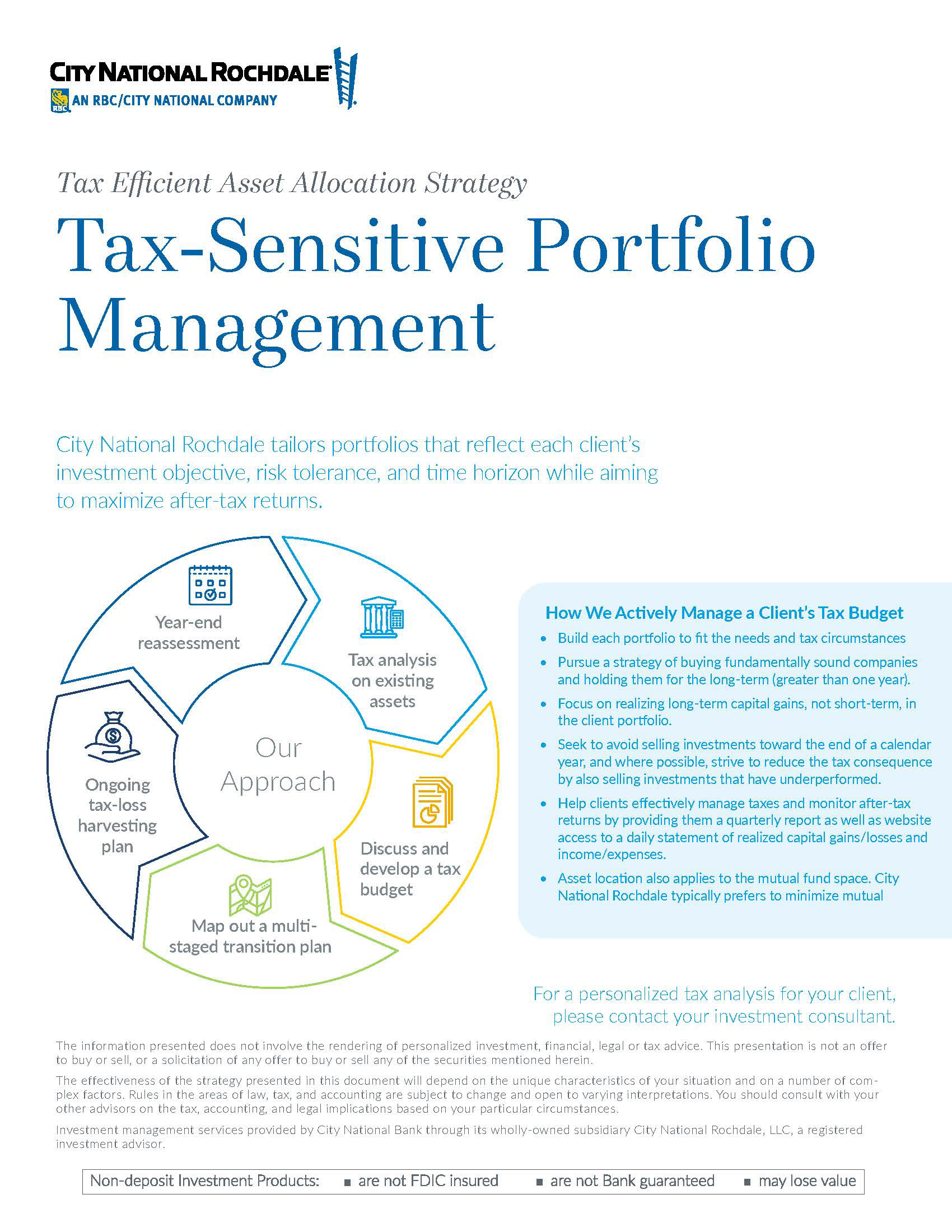
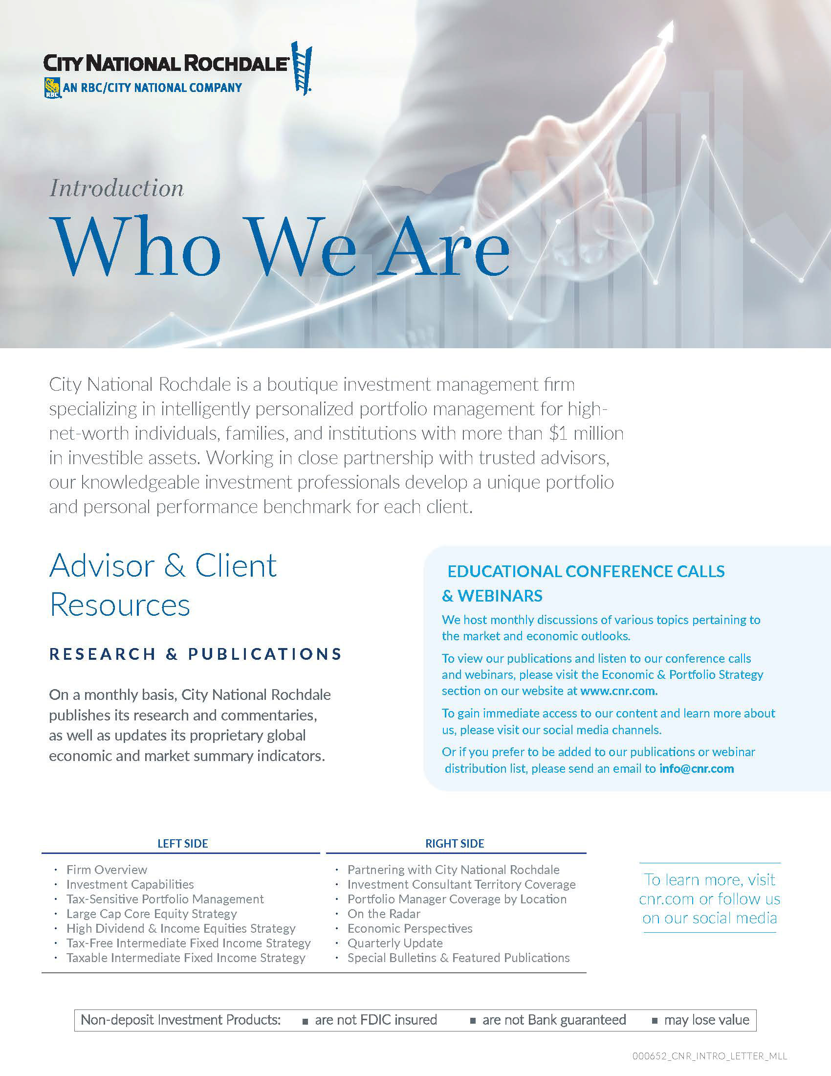
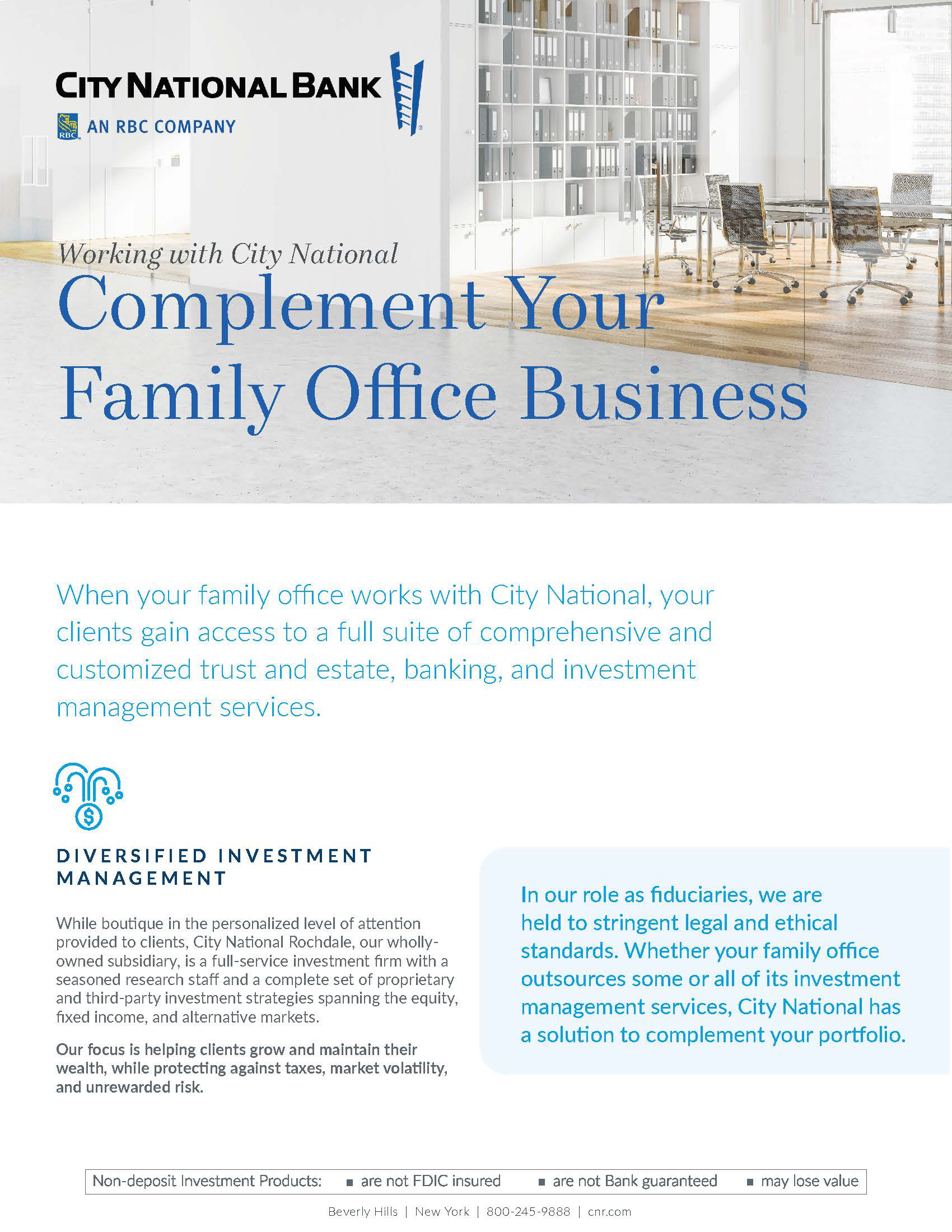
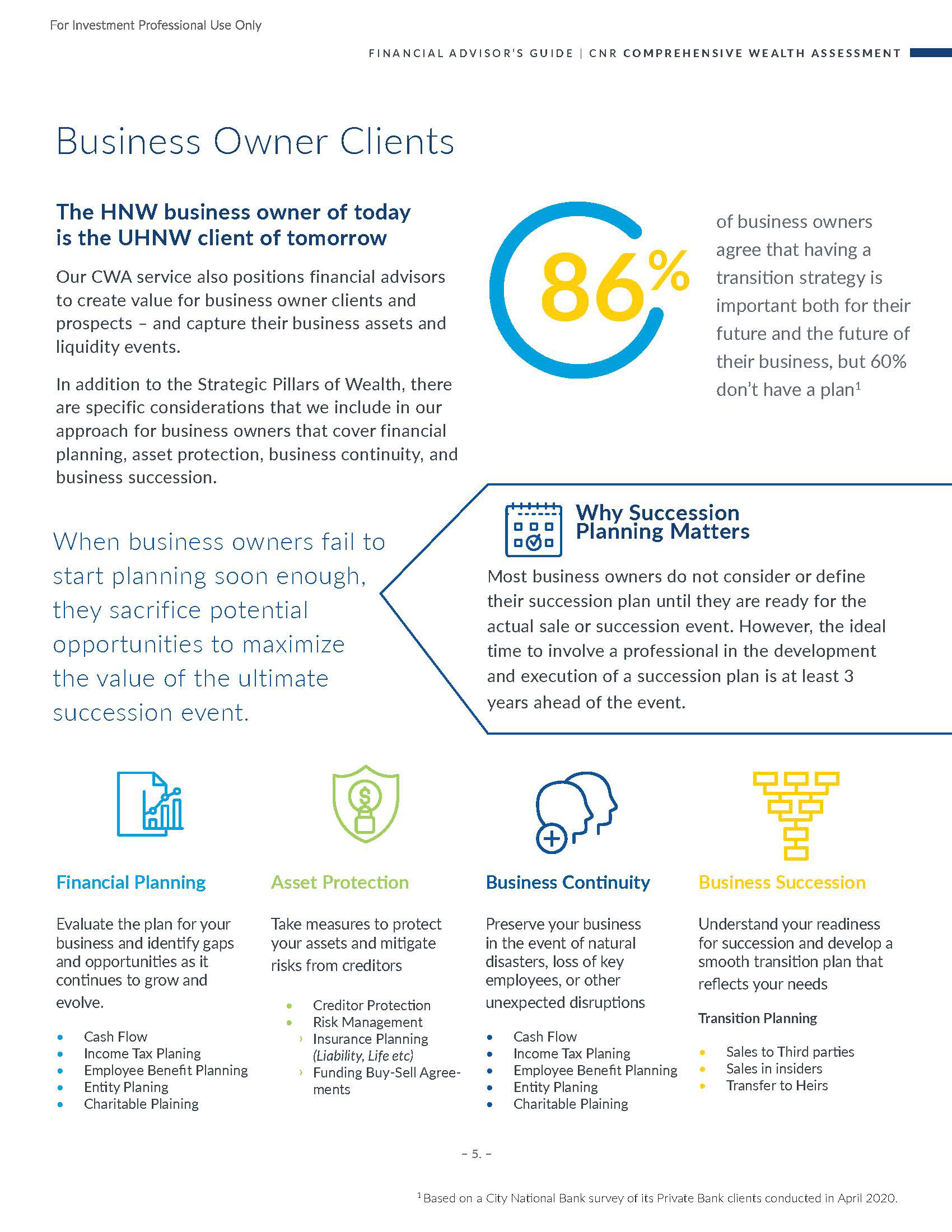
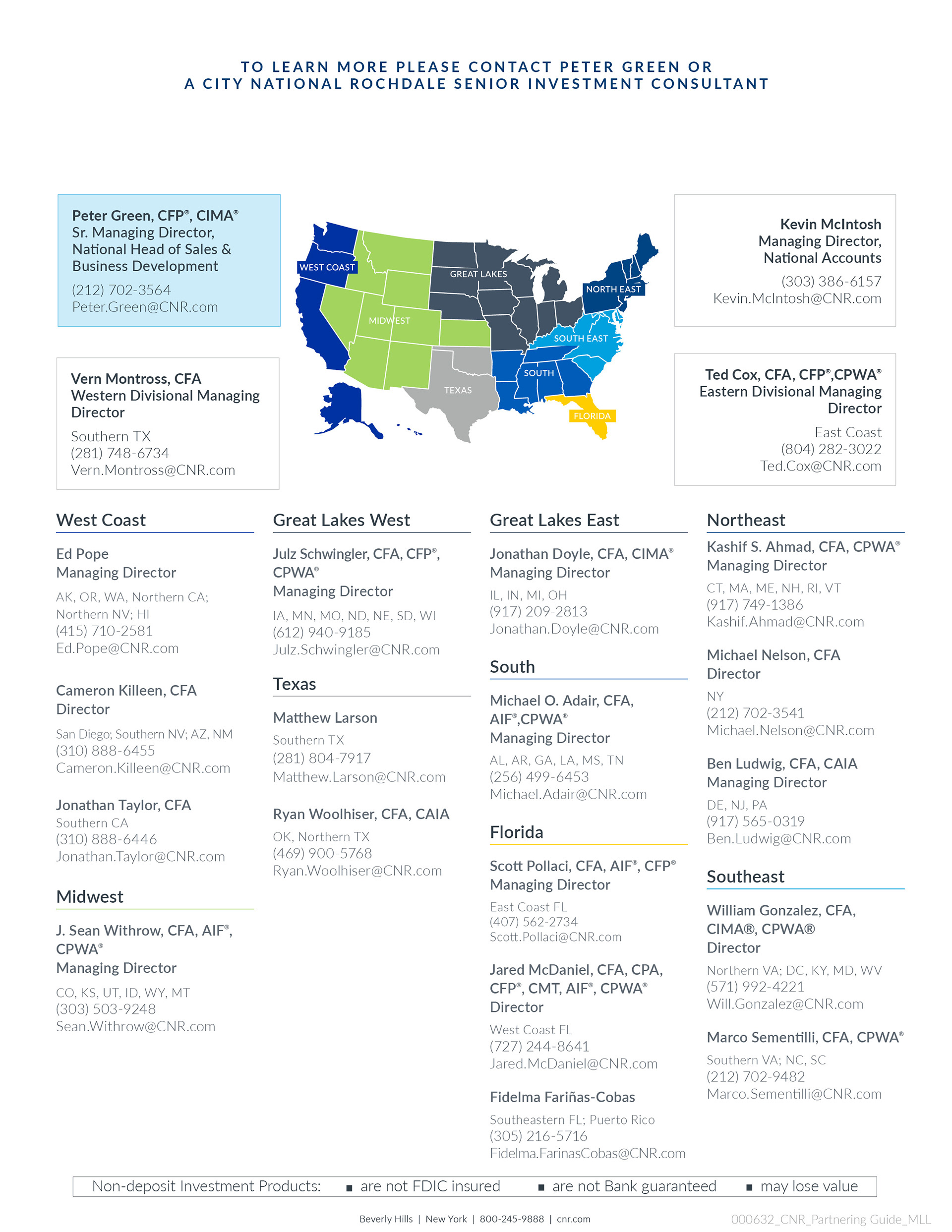
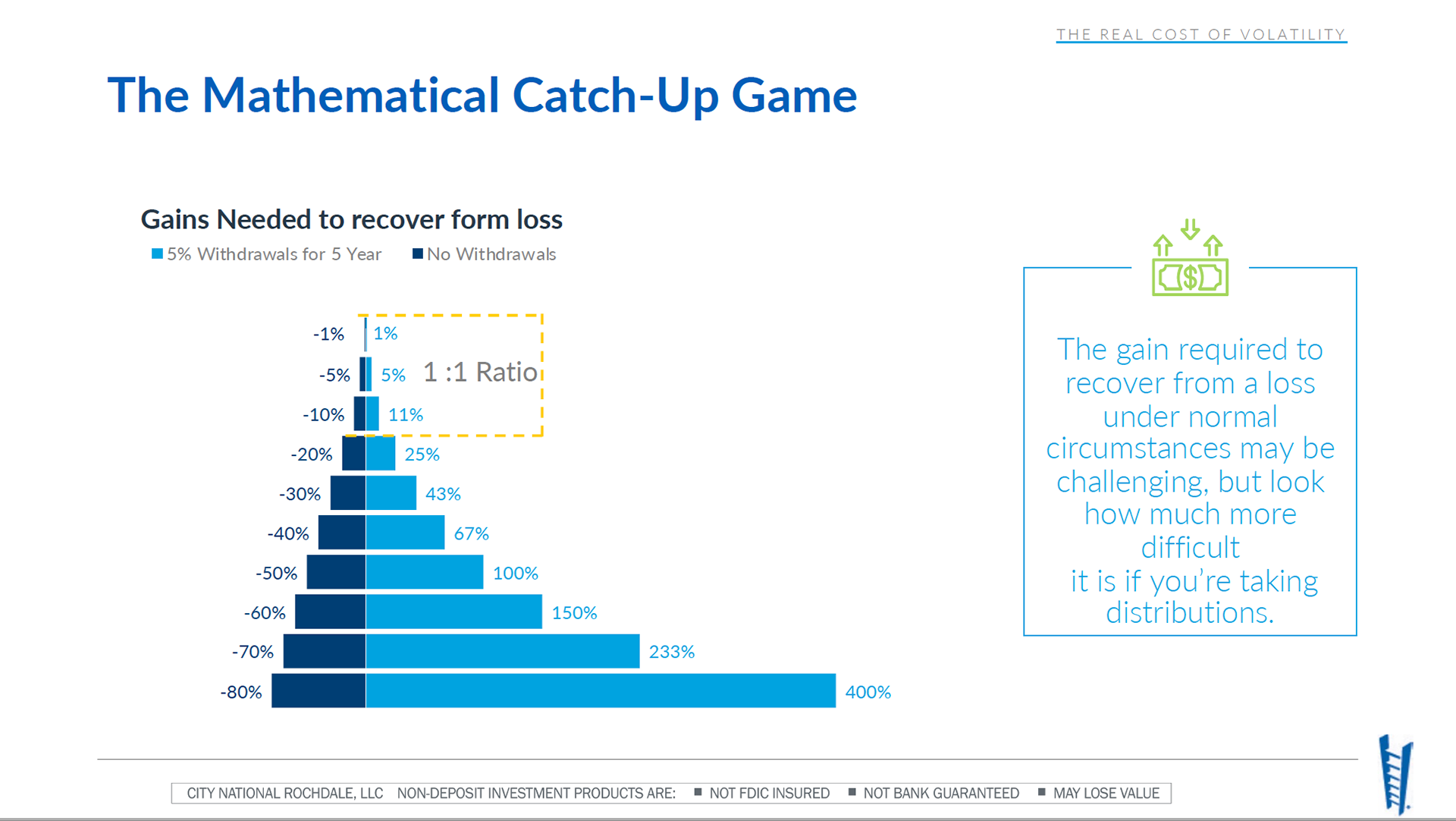
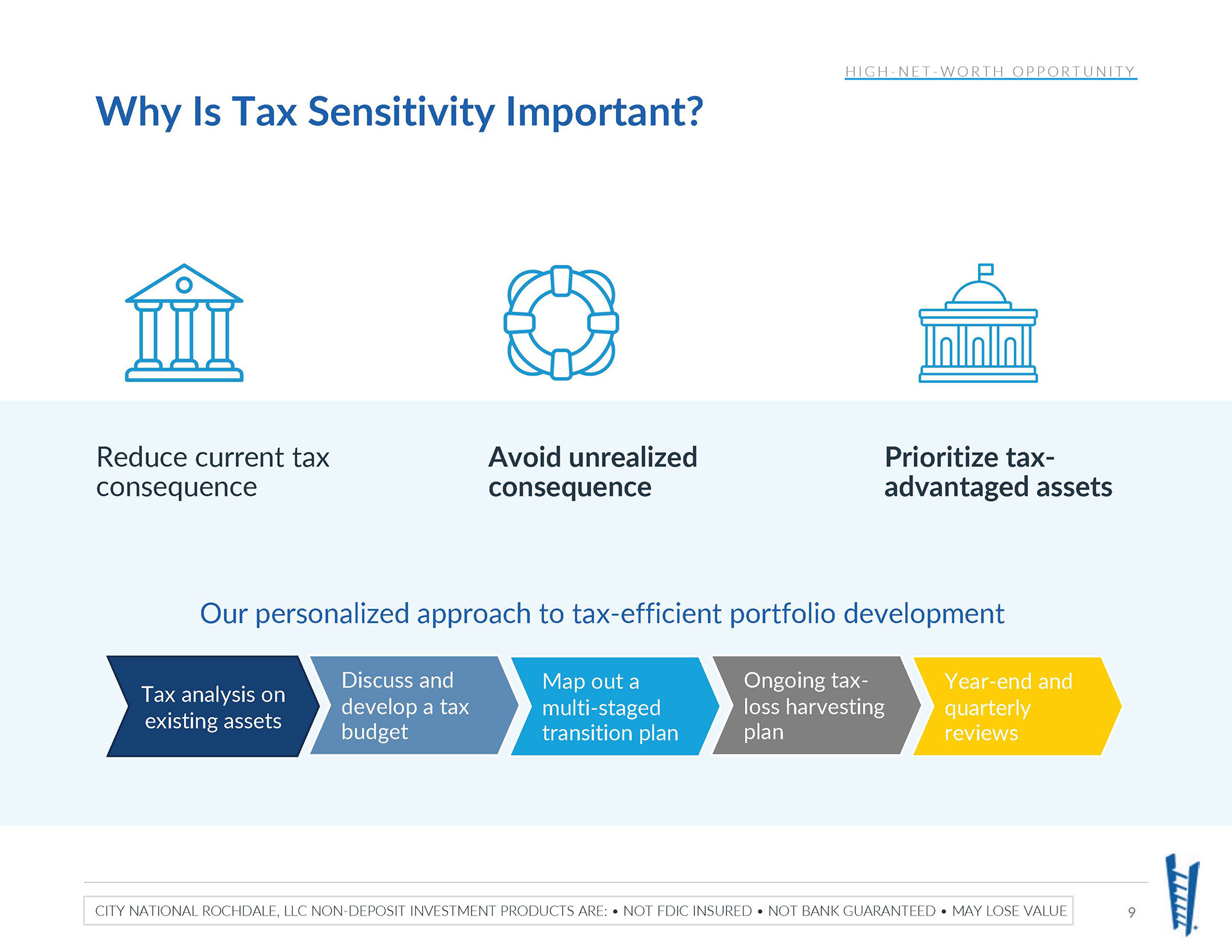
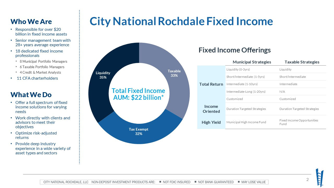
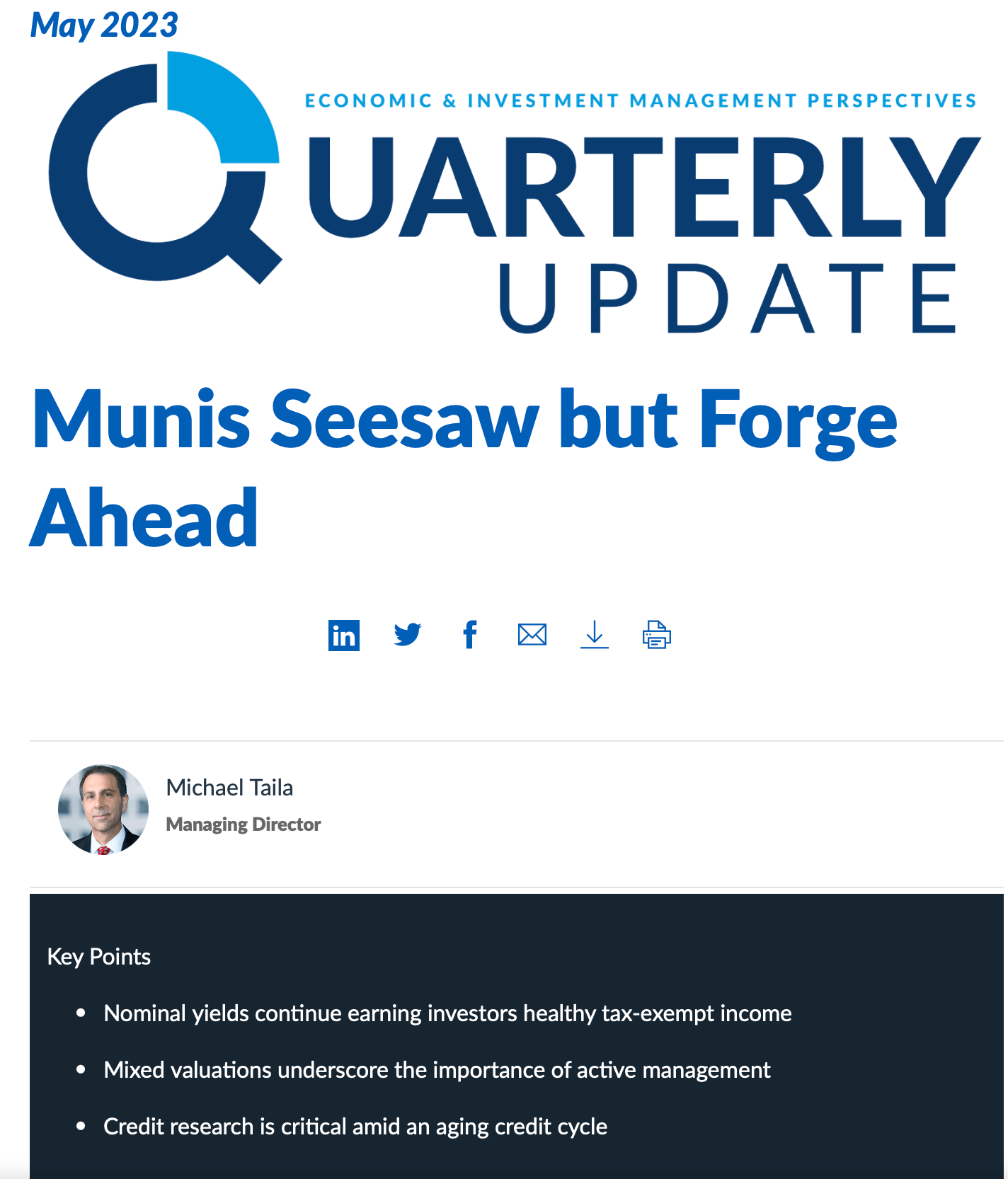
BEFORE & AFTER SAMPLES
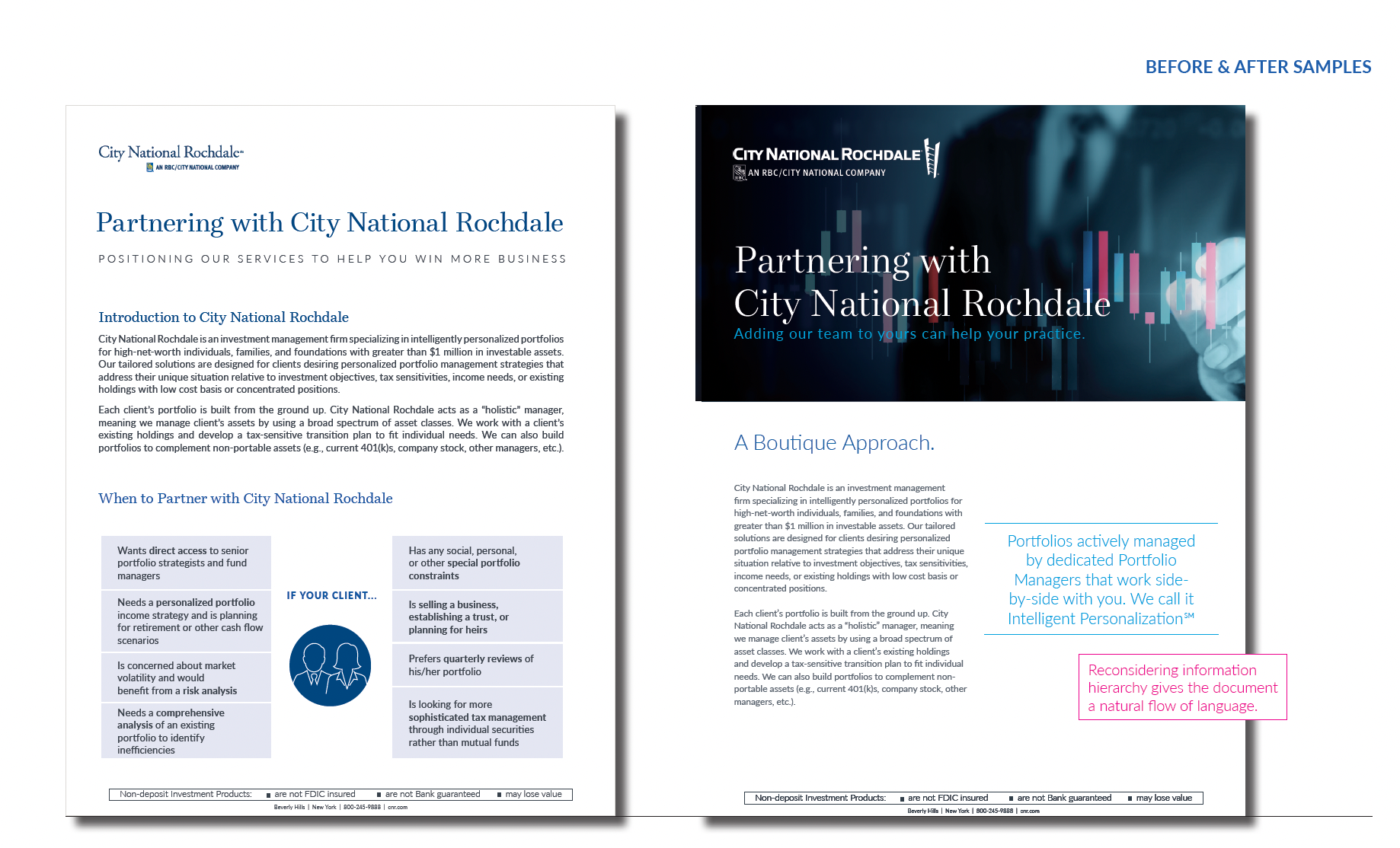
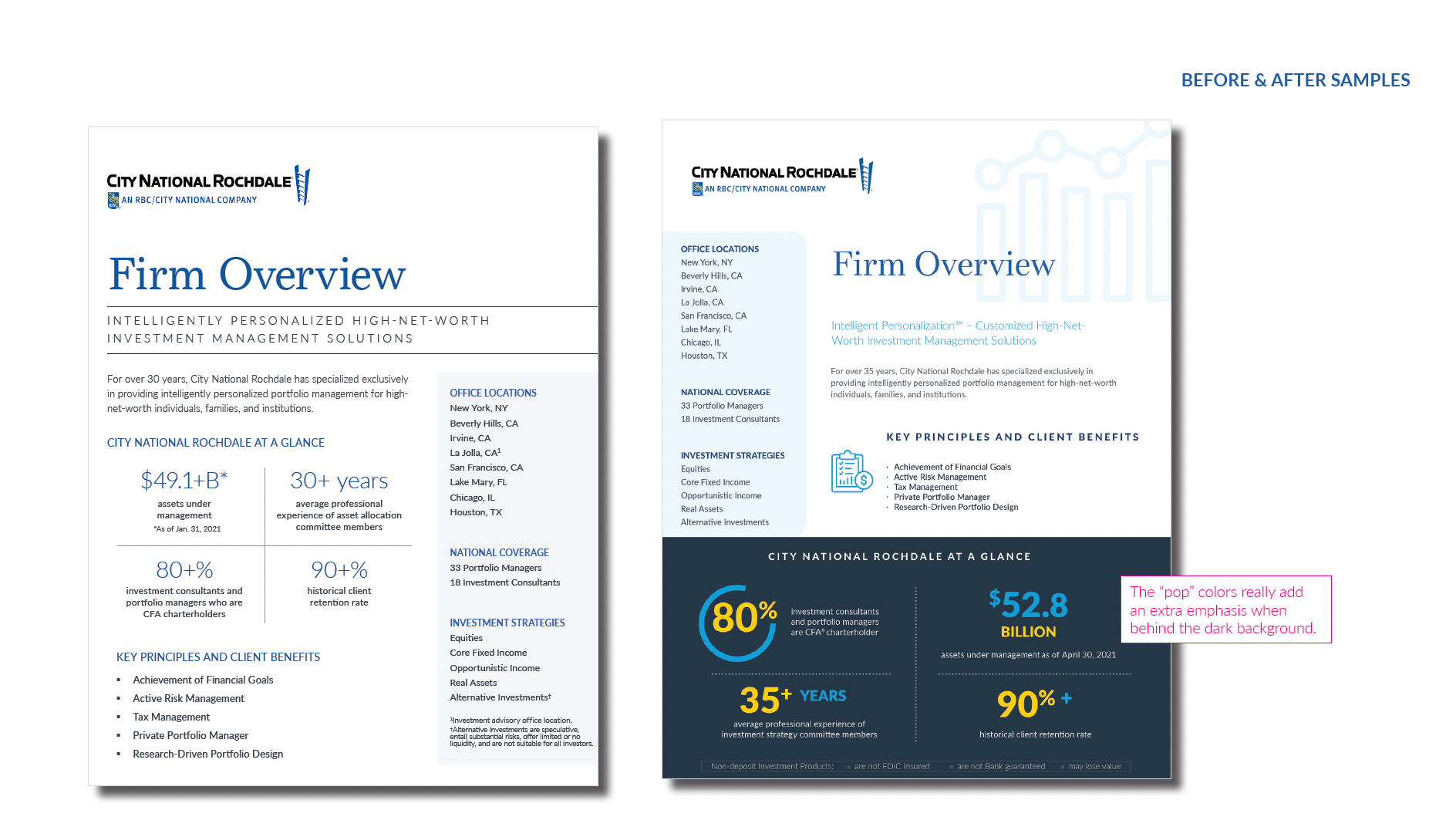
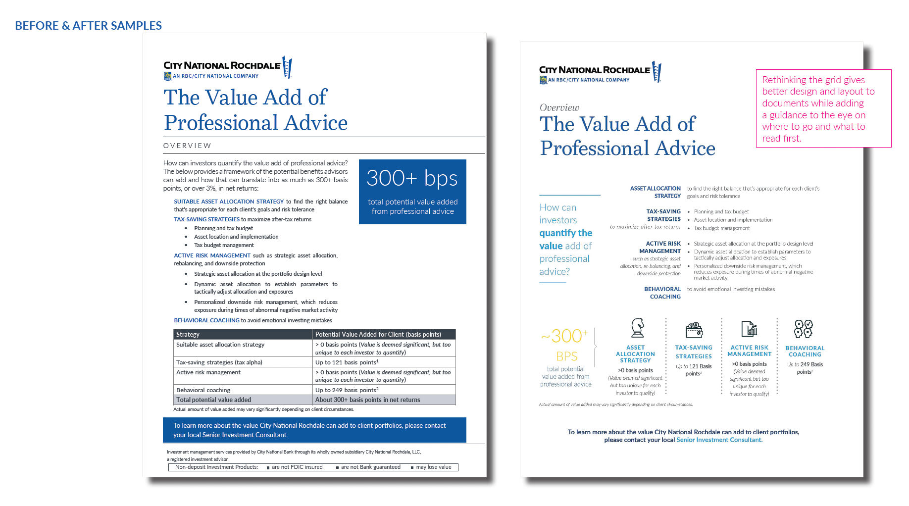
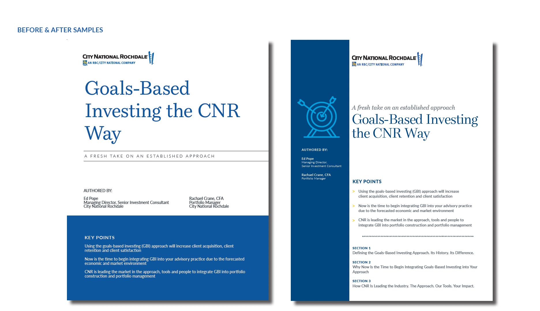
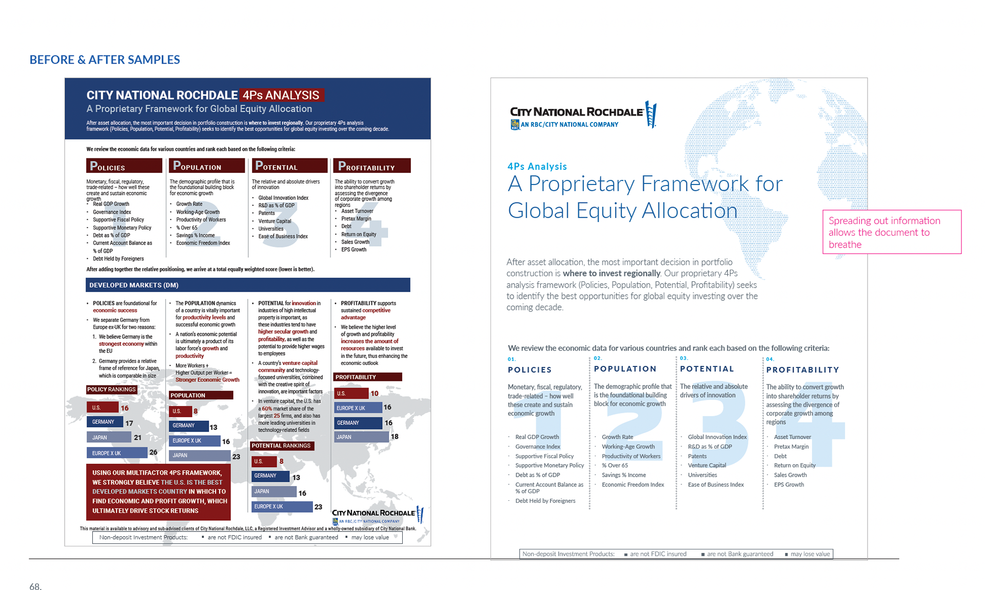
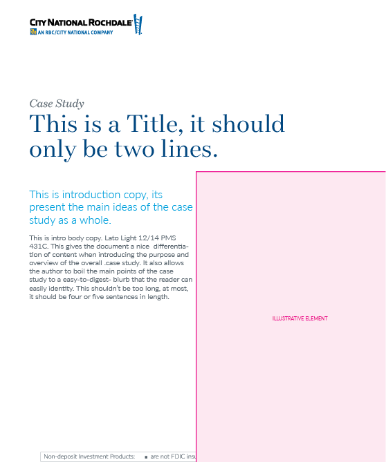
THE SOLUTION: A BRIGHT ENERGETIC CLEAN AND MODERN APPROACH
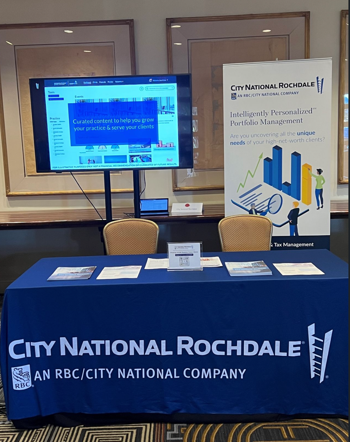
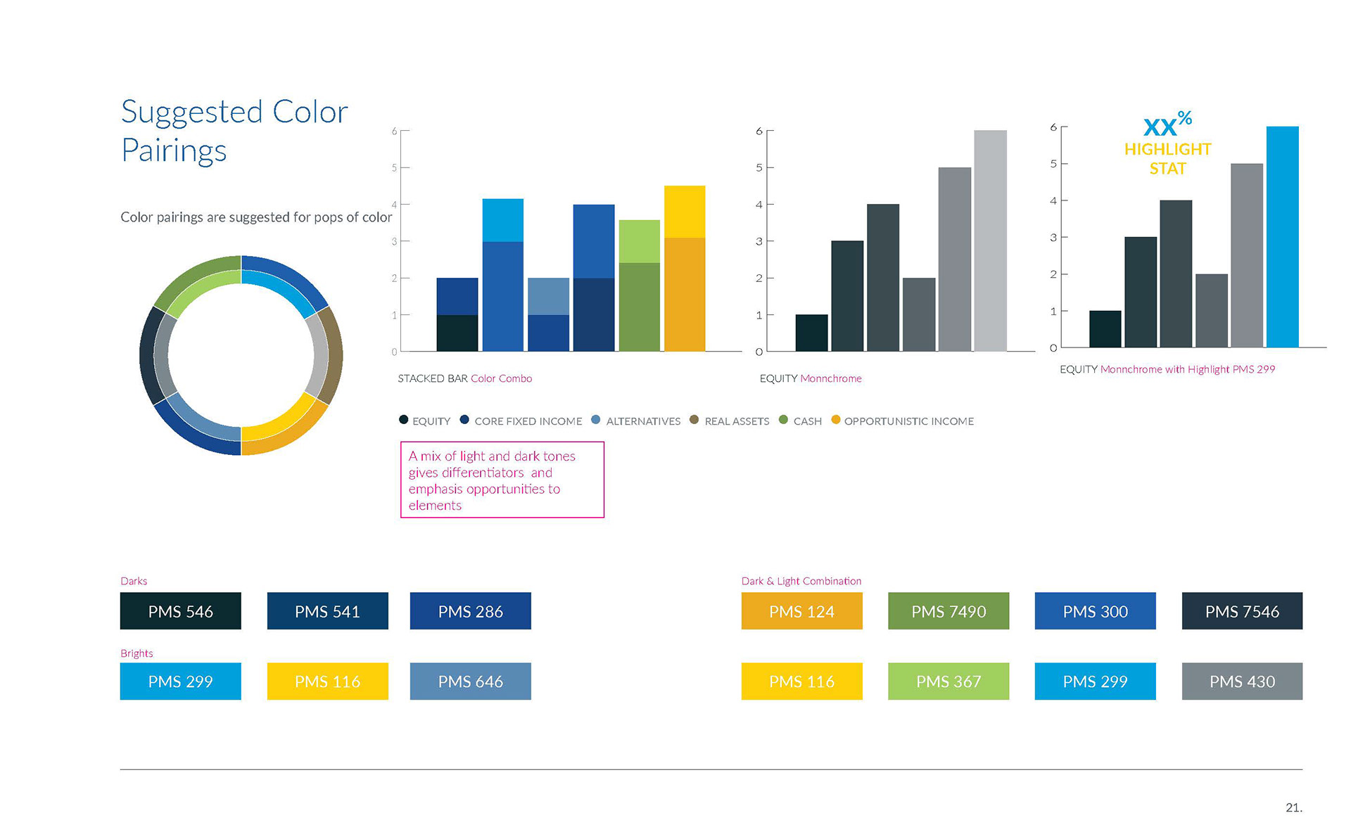
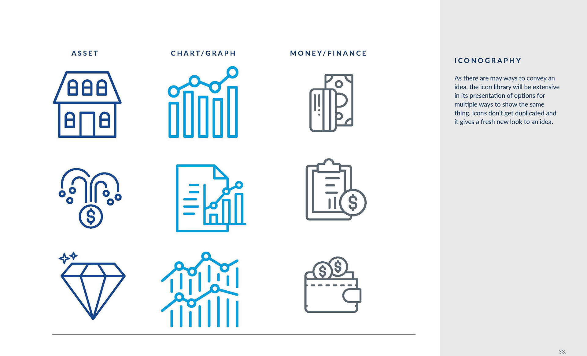
With 'pops' of color, and a clean organized brand identity that can be carried through all. materials the CNR brand blossomed like a flower and continues to expand ever outward with events and new opportunities for design solutions
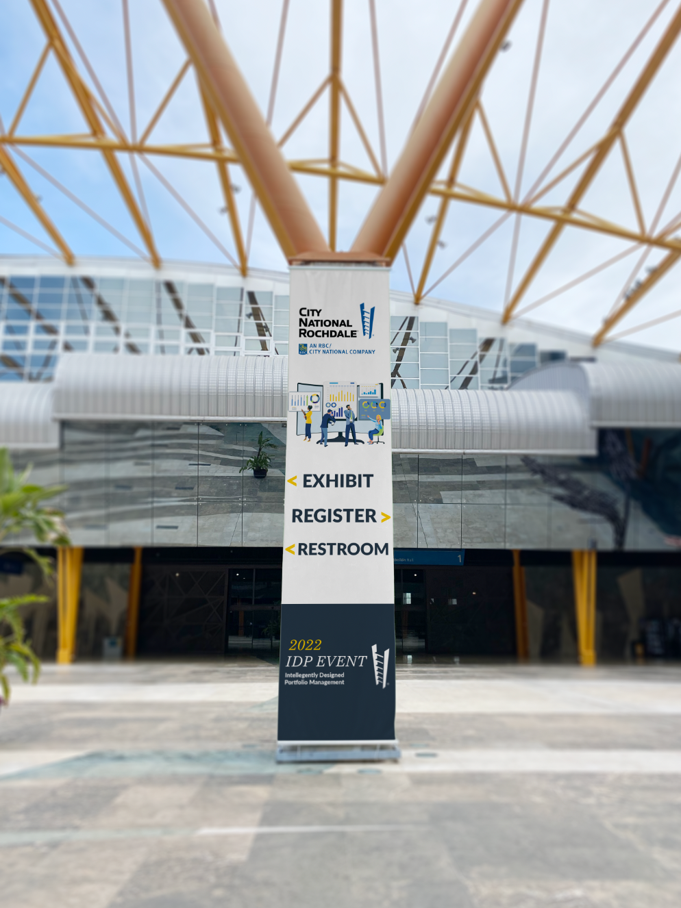
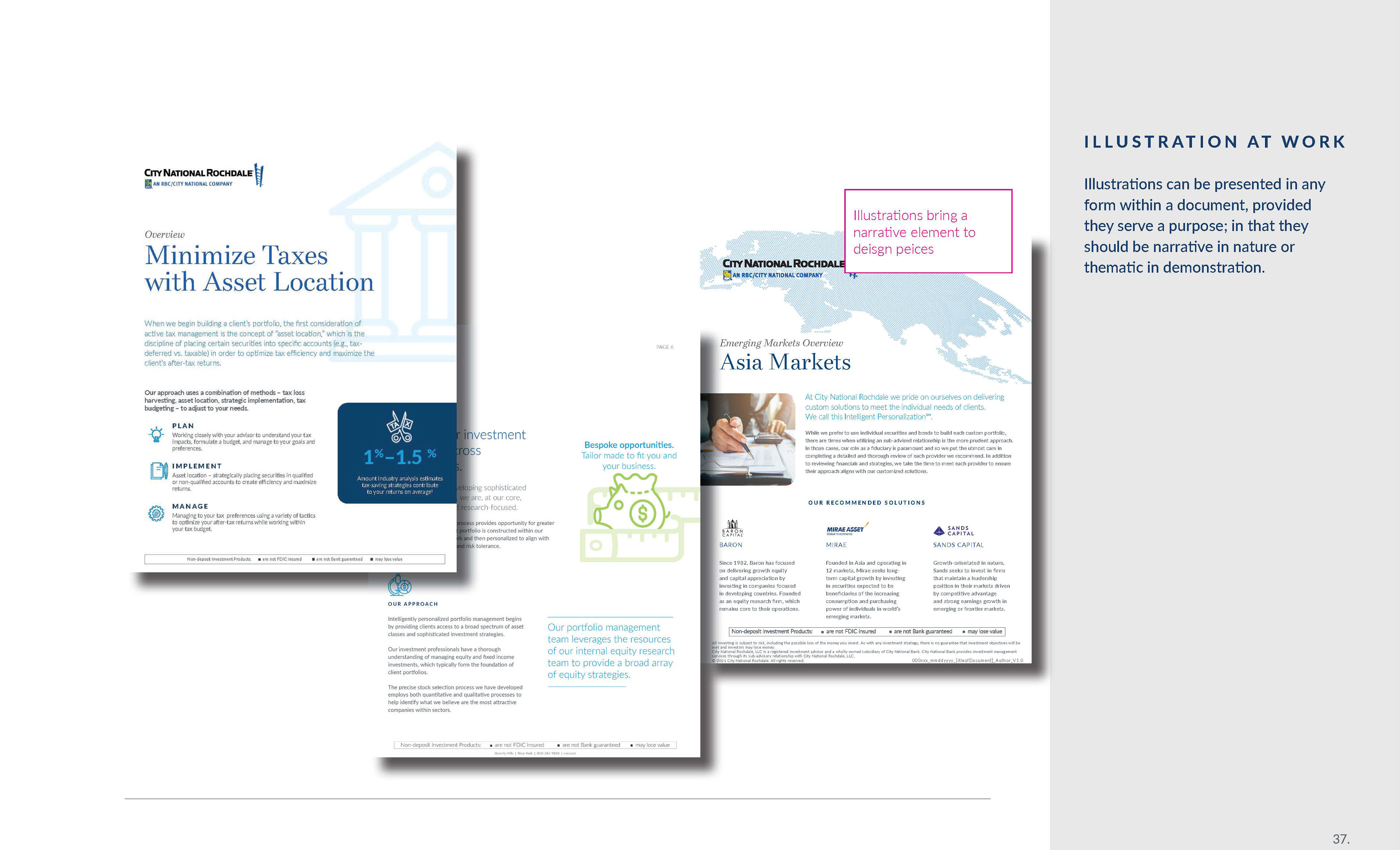
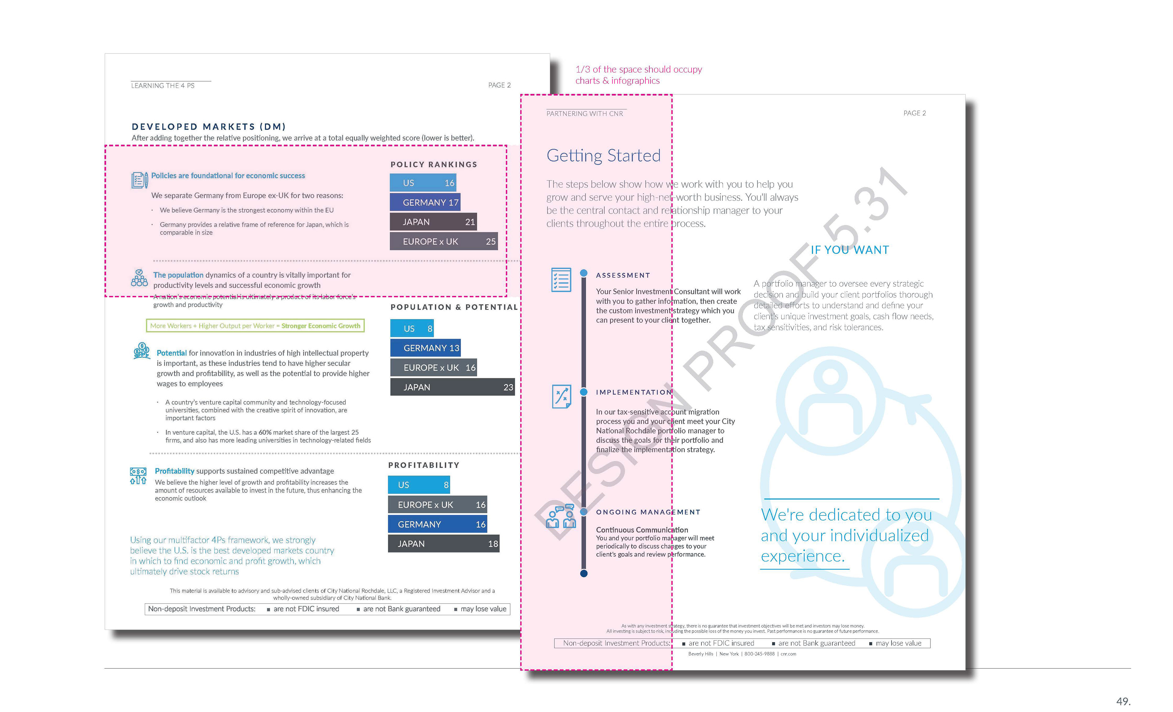
The brand in action
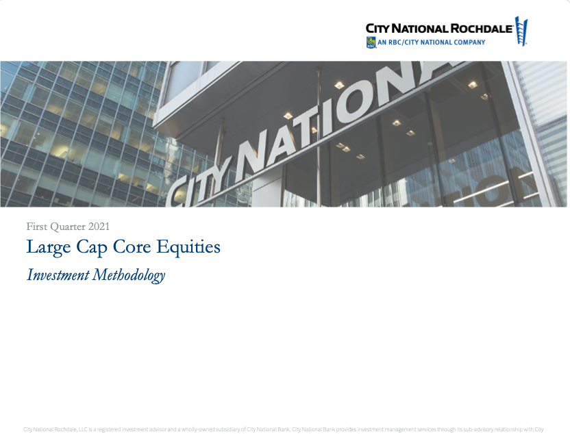
City National of Rochdale's initial ask was a simple one: "Can you make it look better?" The end result speaks to that.